OVERVIEW
Food for Thought, a new startup working on providing Canadian schoolchildren with more diverse lunch options, had developed an MVP which aimed to connect school administrators and parents with restaurant operators. Ultimately, the web-based platform not only needed to acquire new users but also help different types of users (with different goals) complete tasks in a simple and timely manner. Due to the large scope of the project and limited resources, my team opted to focus on perfecting the experience for two user groups, reconsidering the original MVP, and delivering a usability test-ready prototype for phase one.
ROLE
UX/UI designer
TEAM
Two designers and one software engineer
TOOLS
Figma, Figjam, Slack, Google Workspace
TIMELINE
5 weeks

THE CHALLENGE
My team was brought in to assess the usability and viability of a new web-based platform, Food for Thought, designed to help Canadian school administrators and parents find and connect with local restaurants to provide children with a wider variety of healthful meals beyond the standard pizza option. In this case, the project's stakeholder, a software engineer (and mother) who is developing the platform, came to the table with a nearly complete MVP that had been built on a foundation of personal preference rather than actionable data.
THE SOLUTION
Due to time constraints and stakeholder pushback, we were unable to evolve the design as much as I would have liked but, by remaining committed user advocates, we successfully delivered an MVP guided by research and insights. With some effort, my teammate and I convinced the stakeholder to grant us time for user interviews and let those findings dictate the changes to the original user flows and UI design that followed.

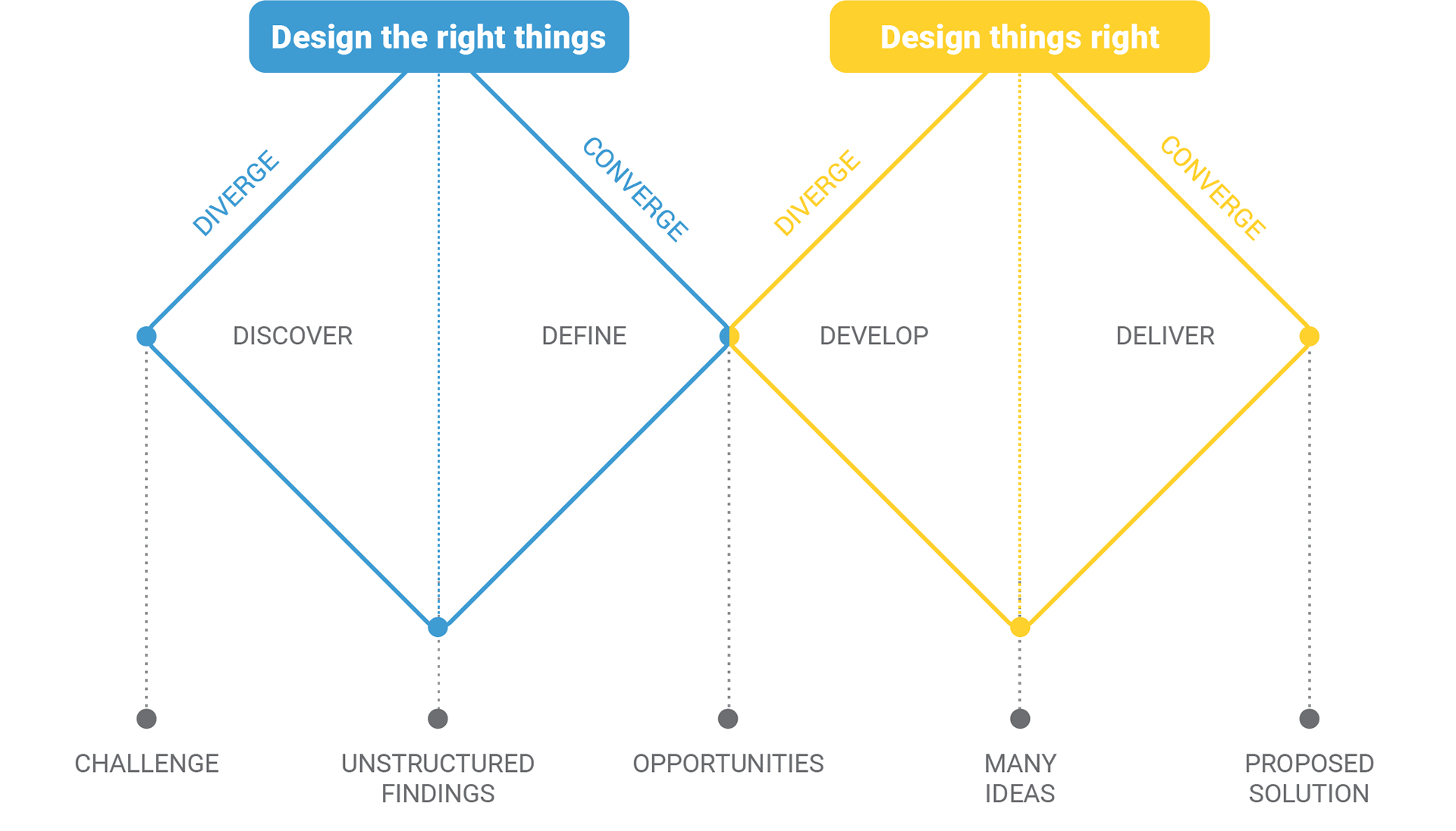
British Design Council's Double Diamond model by Design for Health.
THE PROCESS
As American designers, without children of our own, my teammate and I admittedly knew little to nothing about the Canadian school system, or parents' struggle to ensure their children are properly fed during school hours for that matter. So, in order to minimize personal assumptions, we adopted the double diamond model as a roadmap to move through the novel-to-us problem space. This design system allowed us to clearly identify the most pressing problem, suggest concrete changes to the existing MVP design, and rapidly implement them.
DISCOVER
Exploring the Competitive Landscape
I joined the team after an MVP had already been designed and developed based on the experience of a single parent, the software engineer who planned to bring this product to life—not an ideal scenario. So, unsurprisingly, not only was the product's usability in question but so was its viability. We started by taking a quick dive into the competitive landscape to determine if a product connecting schools and restaurants had already been developed and if so, whether we could improve on it.
After a couple of days of performing secondary research, we discovered a few options that somewhat resembled our premise but which catered to an American audience and primarily targeted parents. Since school systems and regulations are vastly different in Canada, we were ultimately unable to find truly comparable solutions to our problem. Nevertheless, this was an illuminating exercise that highlighted the need to speak with users before further developing the product.
Going Straight to the Source
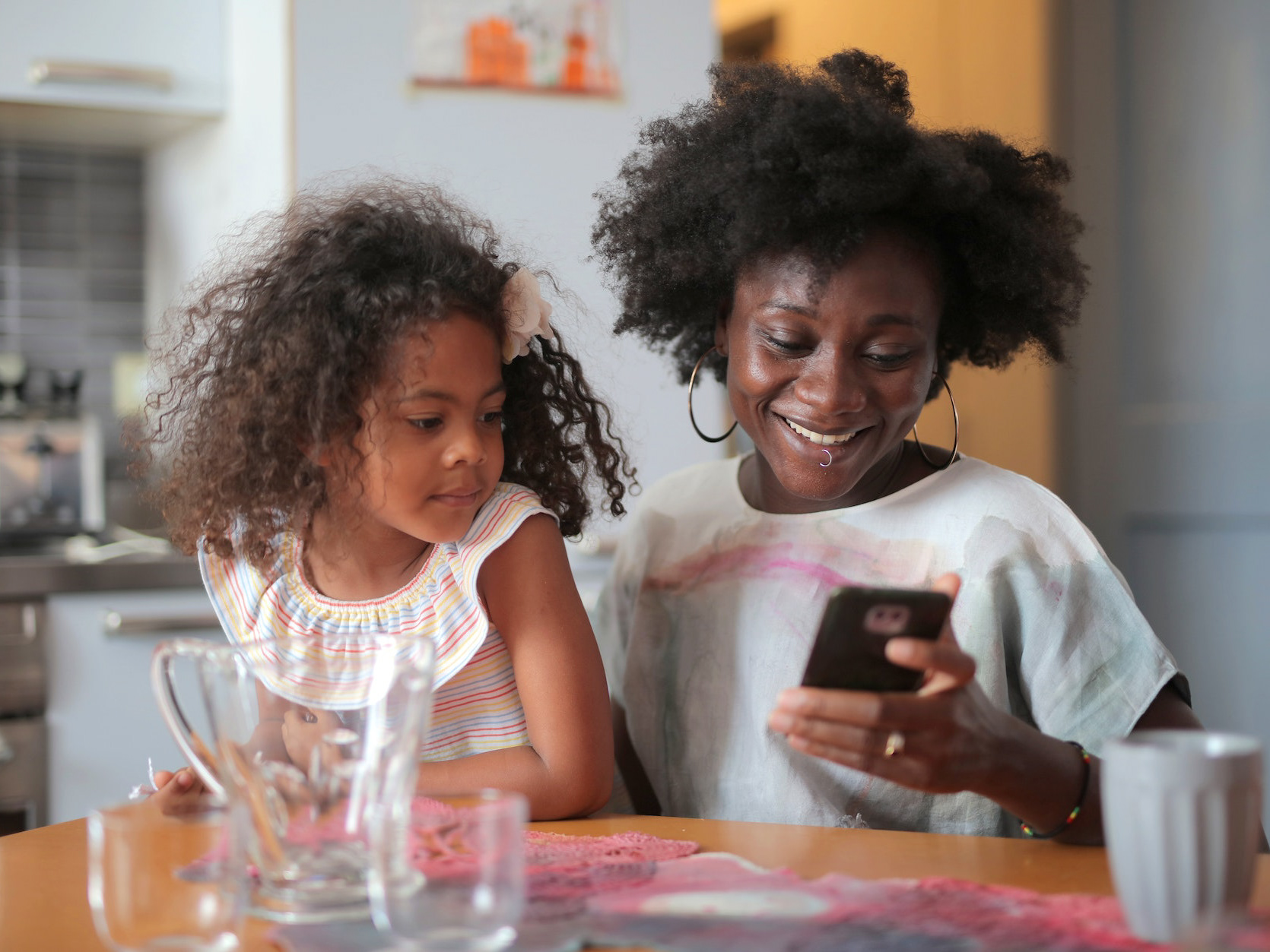
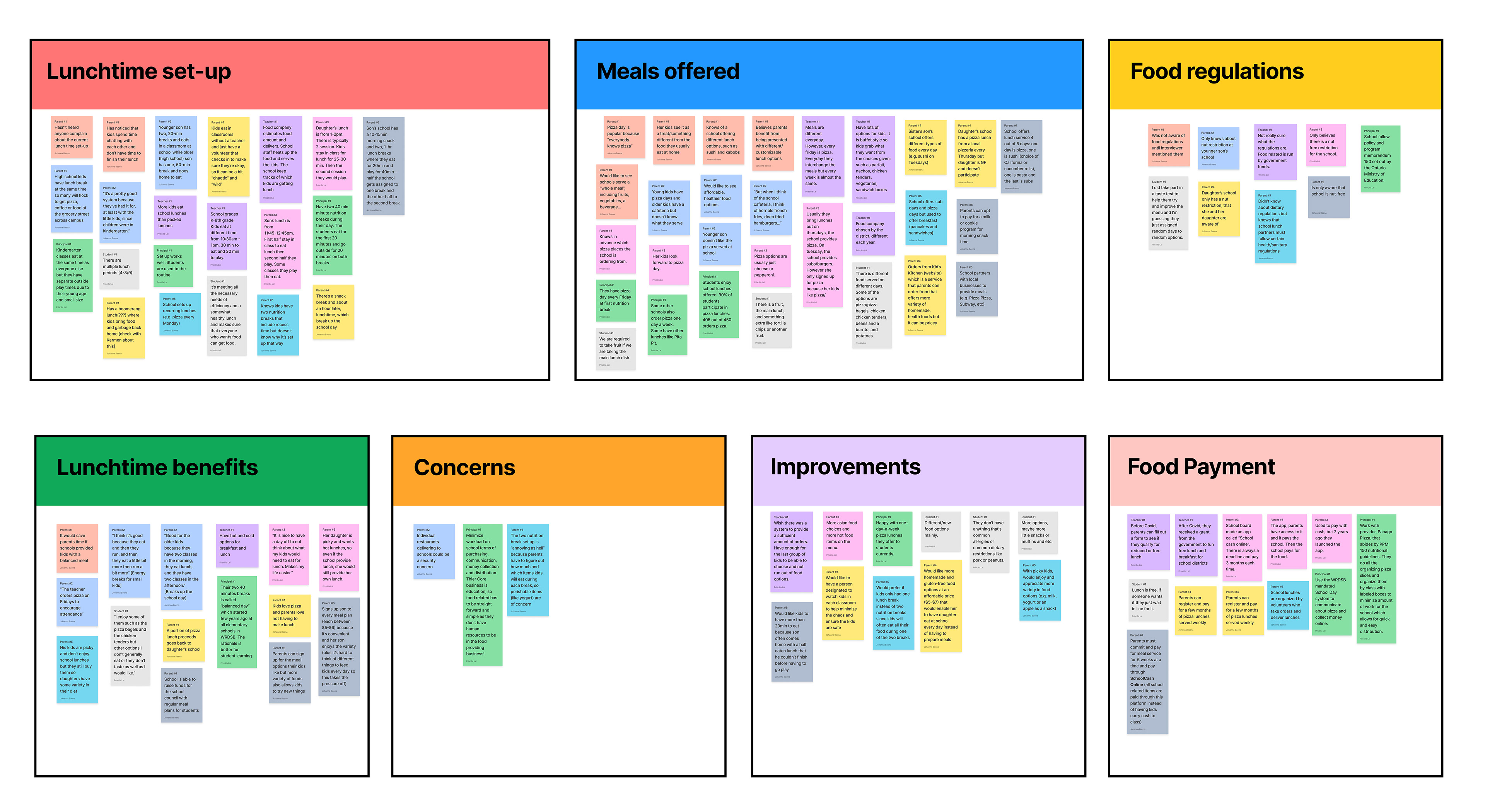
We had no doubt that speaking with potential users was necessary but things are not often simple and straightforward. First, we had to convince the stakeholder that spending time on this endeavor would result in a more successful end product. We ultimately prevailed, although in a more limited way than we would have preferred. Since we began this project at the end of the school year, we had limited access to school administrators so, using a combination of surveys and phone interviews, we primarily gathered insights from parents along with one secretary to the school principal and a couple of teachers. This was not the sample interview group we sought but it provided us with enough data to begin to understand the problem.
DEFINE
Making Sense of the Data
As my teammate and I analyzed our interview notes and began to consider the existing product, we came to the realization that the project would be more complex than we'd initially anticipated. The reality was that the platform needed to be something different for each user group—parents, school administrators, and food providers—but somehow manage to provide a cohesive experience for all. Unfortunately, our limited time frame meant we would only be able to focus on two user groups.
Adding the 'Persona' in Personalized Experience
Having interviewed parents and school administrators we decided to move forward with these user groups for the time being. The next step was to craft personas that would keep the team aligned with each user type. Fortunately, we had enough data to produce a strong parent persona but only enough information to produce a proto-persona of a school administrator, so this identity would have to be validated with more interviews at a later time.
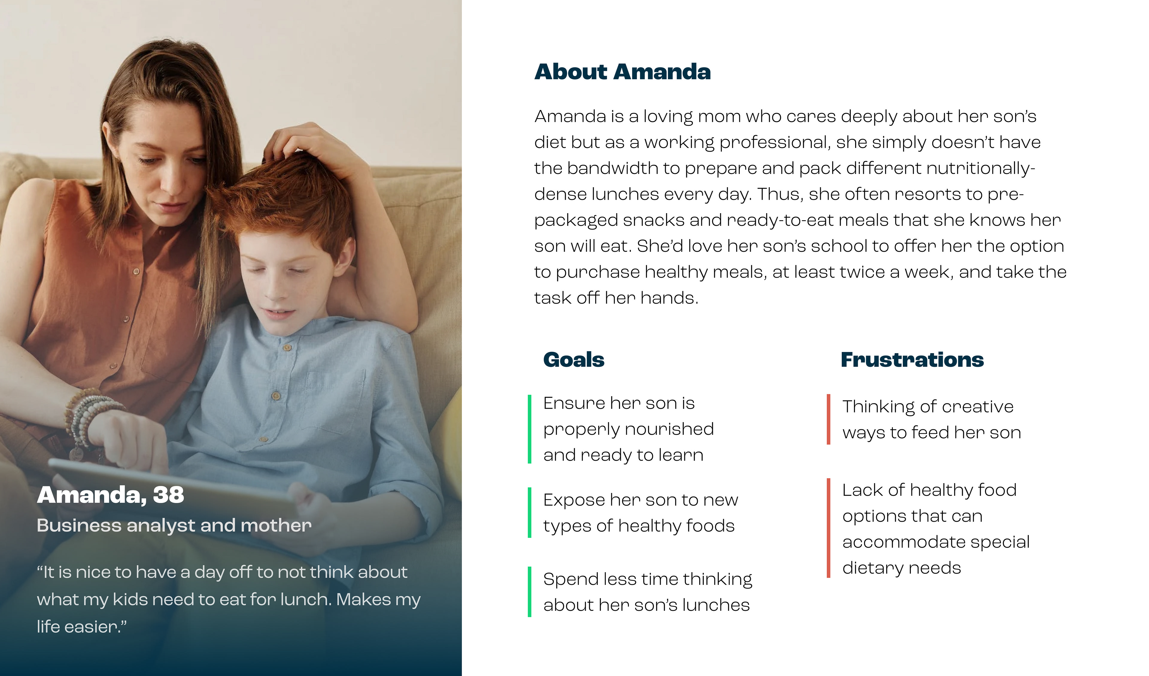
Parents struggle to keep up with packing their kids' lunches and would like to see healthy food options available at schools.
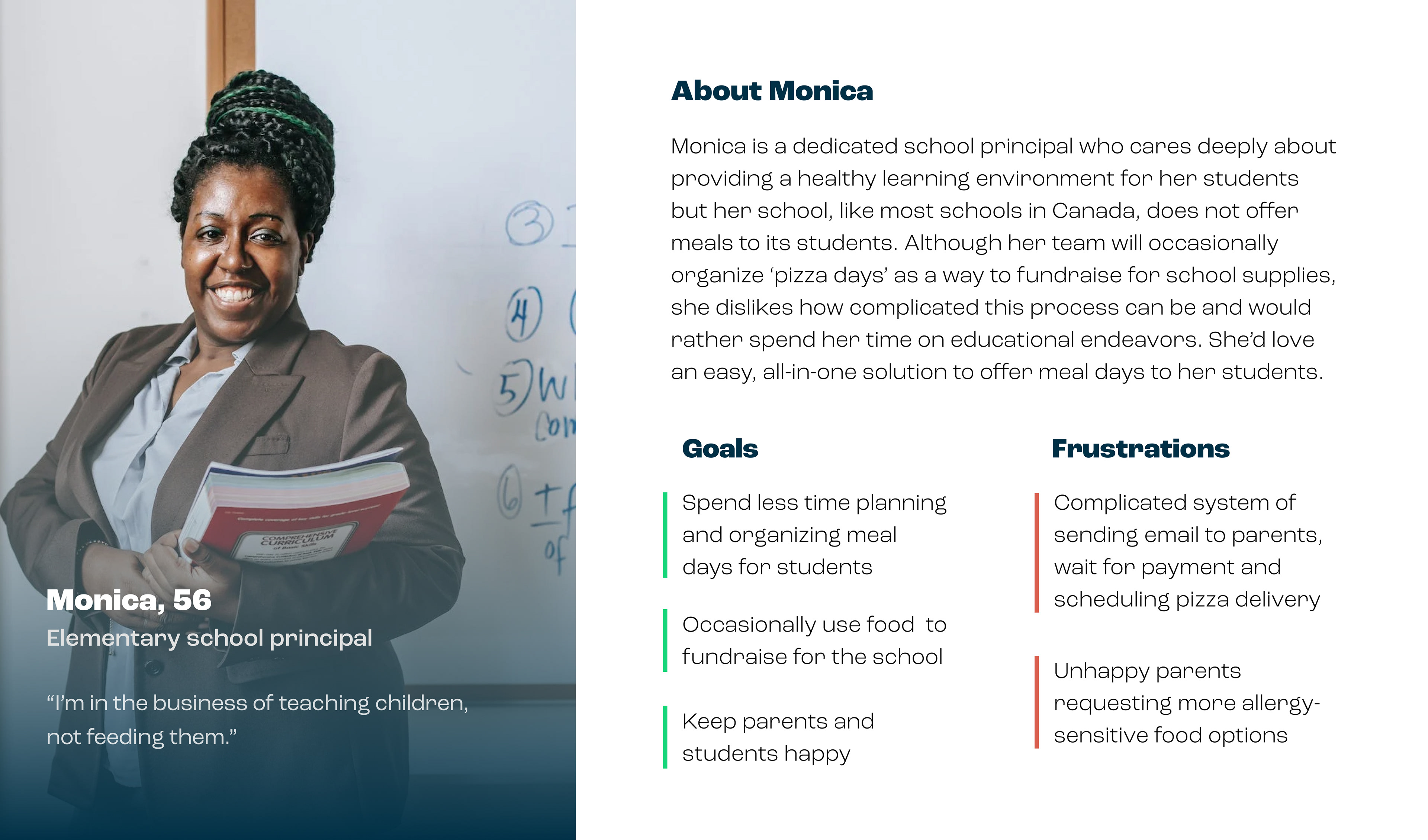
School admins don't want planning and providing school lunches for students to be one more complicated thing they have to do.
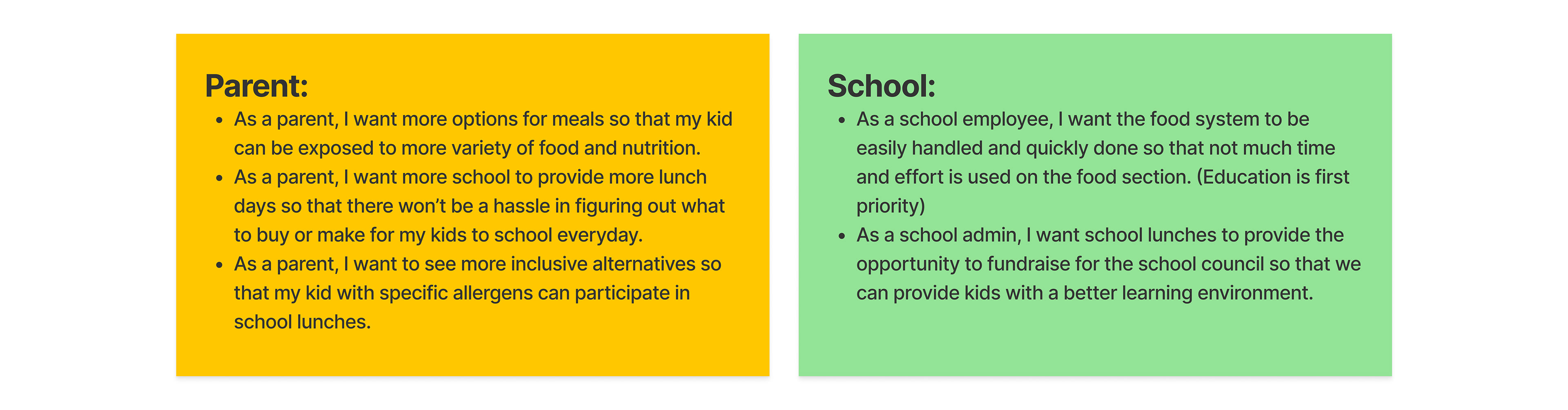
A User's Journey
In order to fully understand what each user would need from this product, we developed a few stories that not only helped humanize the experience but also acted as blueprints for how the user would potentially navigate the site.
DEVELOP
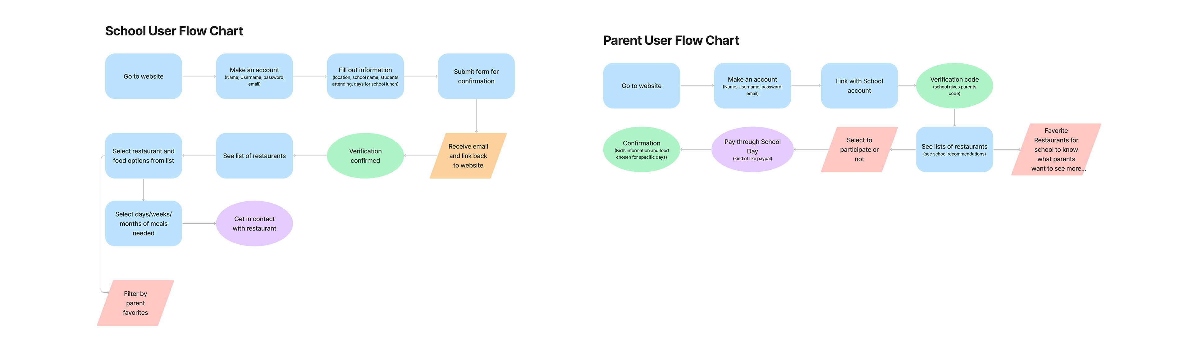
User Flows
Now we were finally ready to move on to the design but first, we needed to reexamine the existing user flows. Since both user groups in question—parents and school administrators—sought expediency, my team redesigned the experience to minimize the steps required to complete tasks.
Starting with a Sketch
In an effort to develop multiple versions of a new and improved MVP, my teammate and I sketched out key screens separately and later came together to share what we'd come up with. We compared our designs and combined elements from both our sketched screens to arrive at a design that would fit the needs of our users and follow usability best practices.
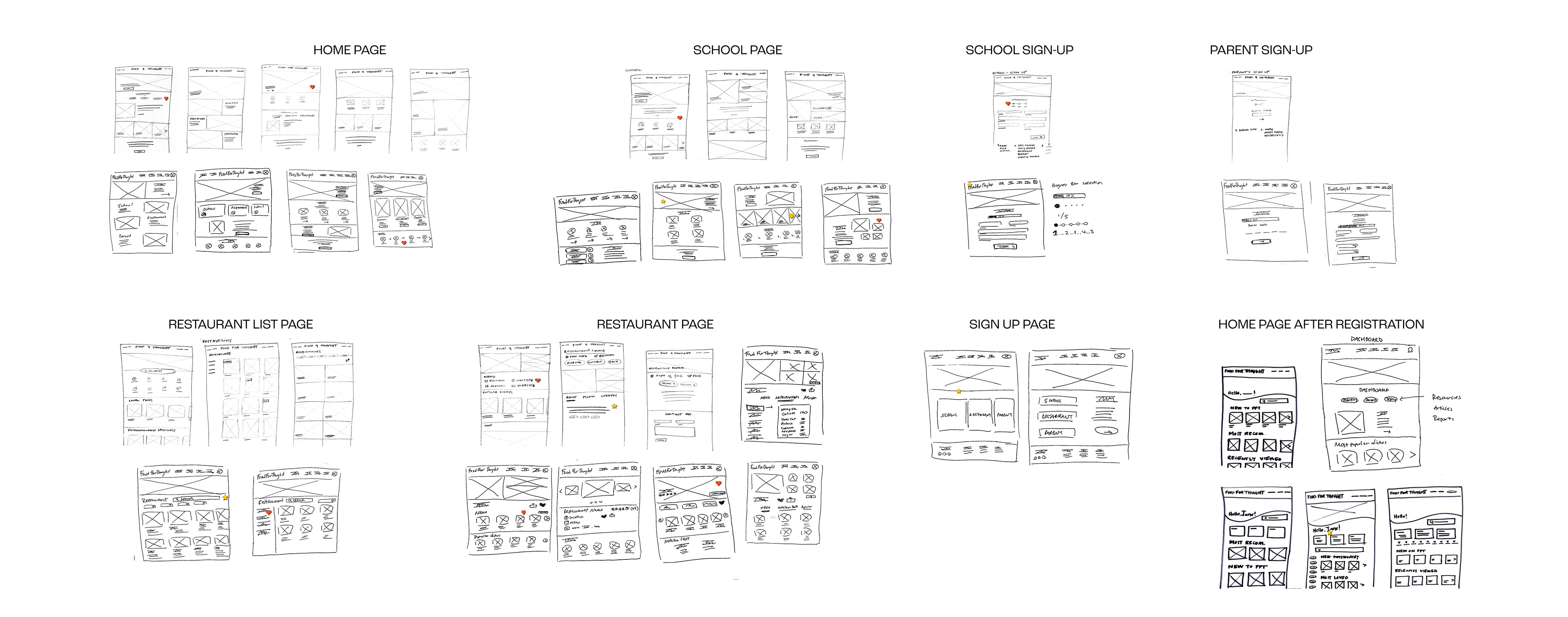
A sea of sketches from which we mixed and matched elements to create a single, cohesive design.
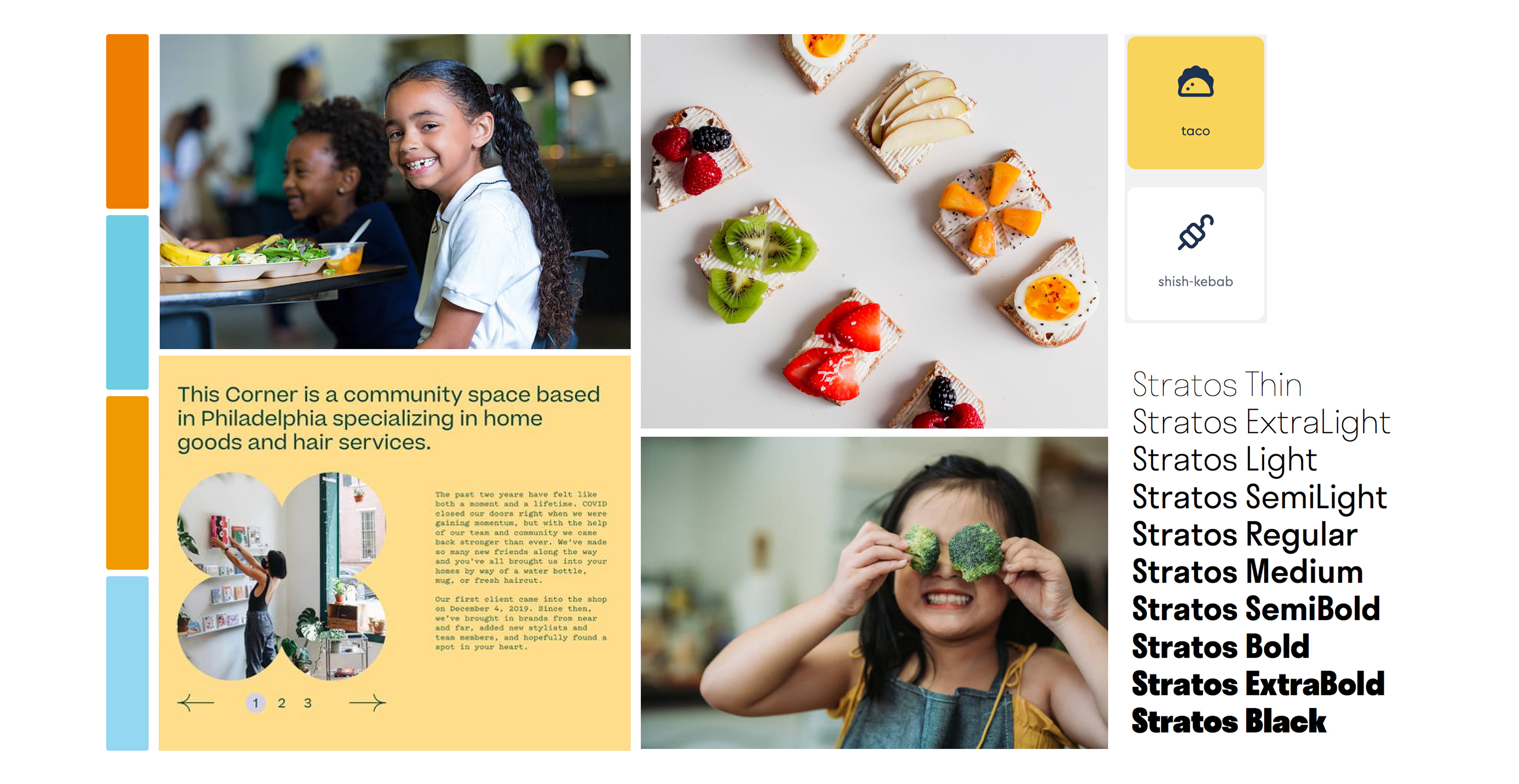
It's a Mood
We followed a similar process to determine a visual style for the website by crafting different mood boards separately and later allowing the stakeholder to select her favorite direction. In this case, we were able to bring style elements from both boards into a single, cohesive direction that conveys a sense of playfulness while remaining trustworthy.
DELIVER
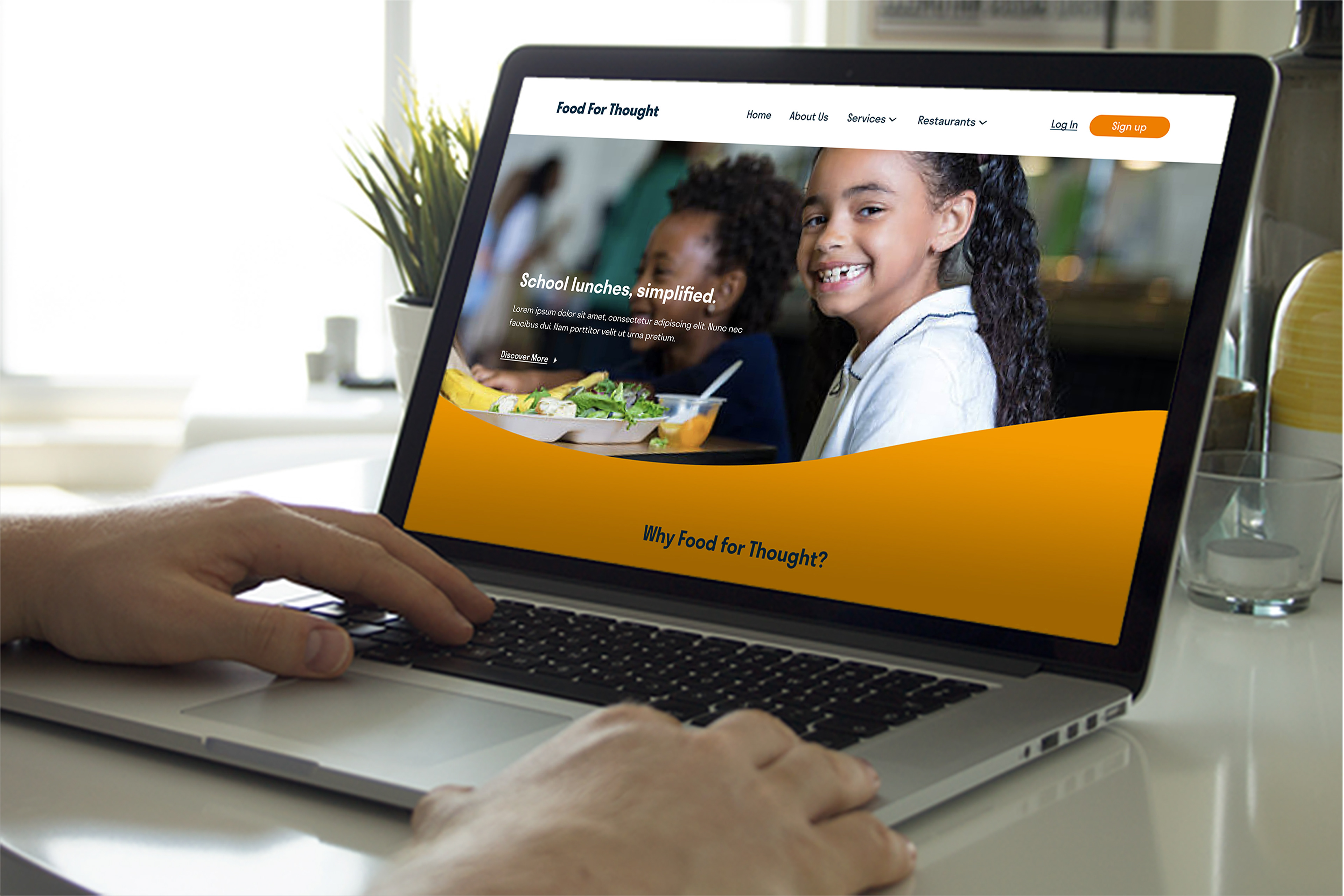
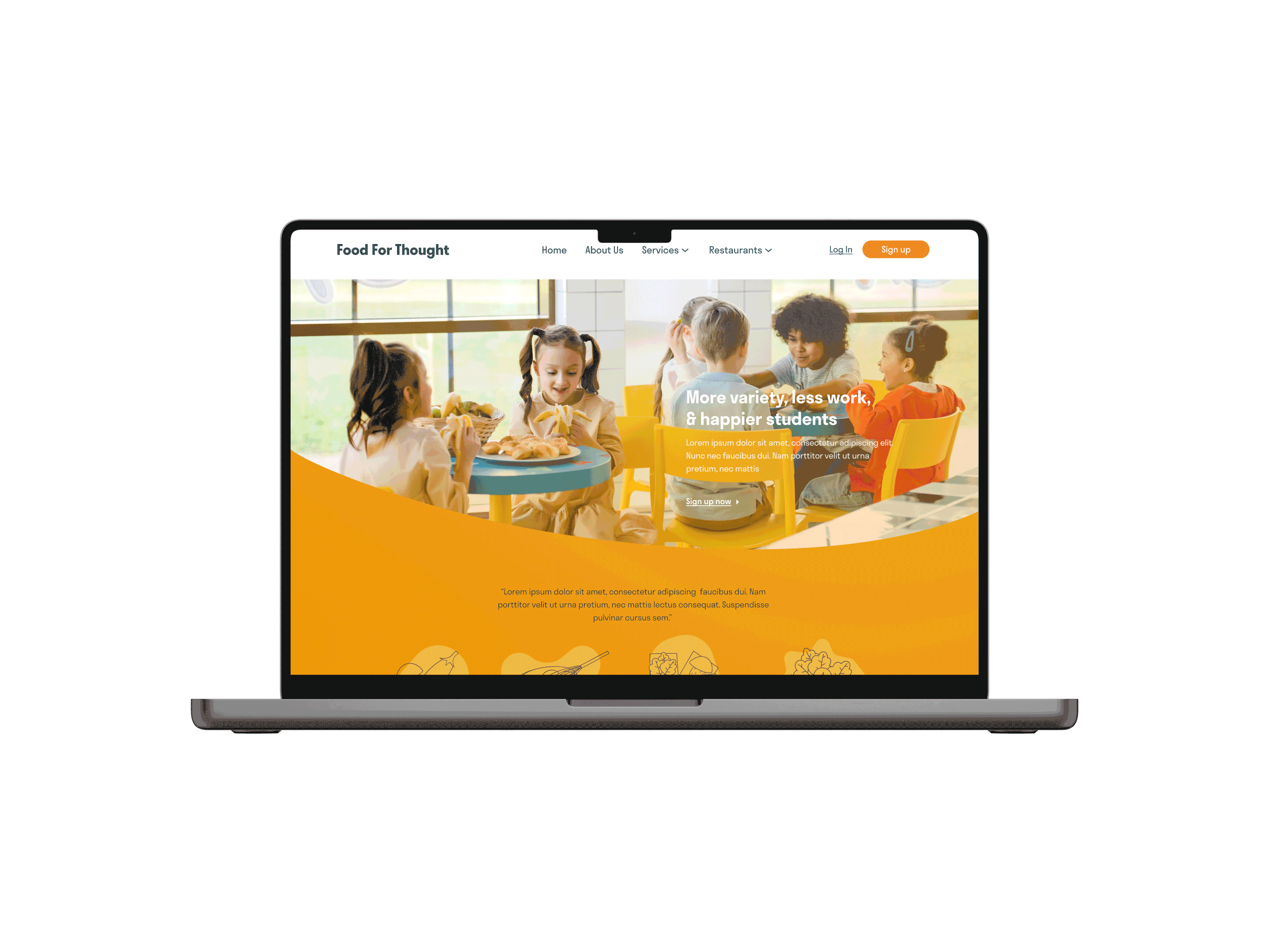
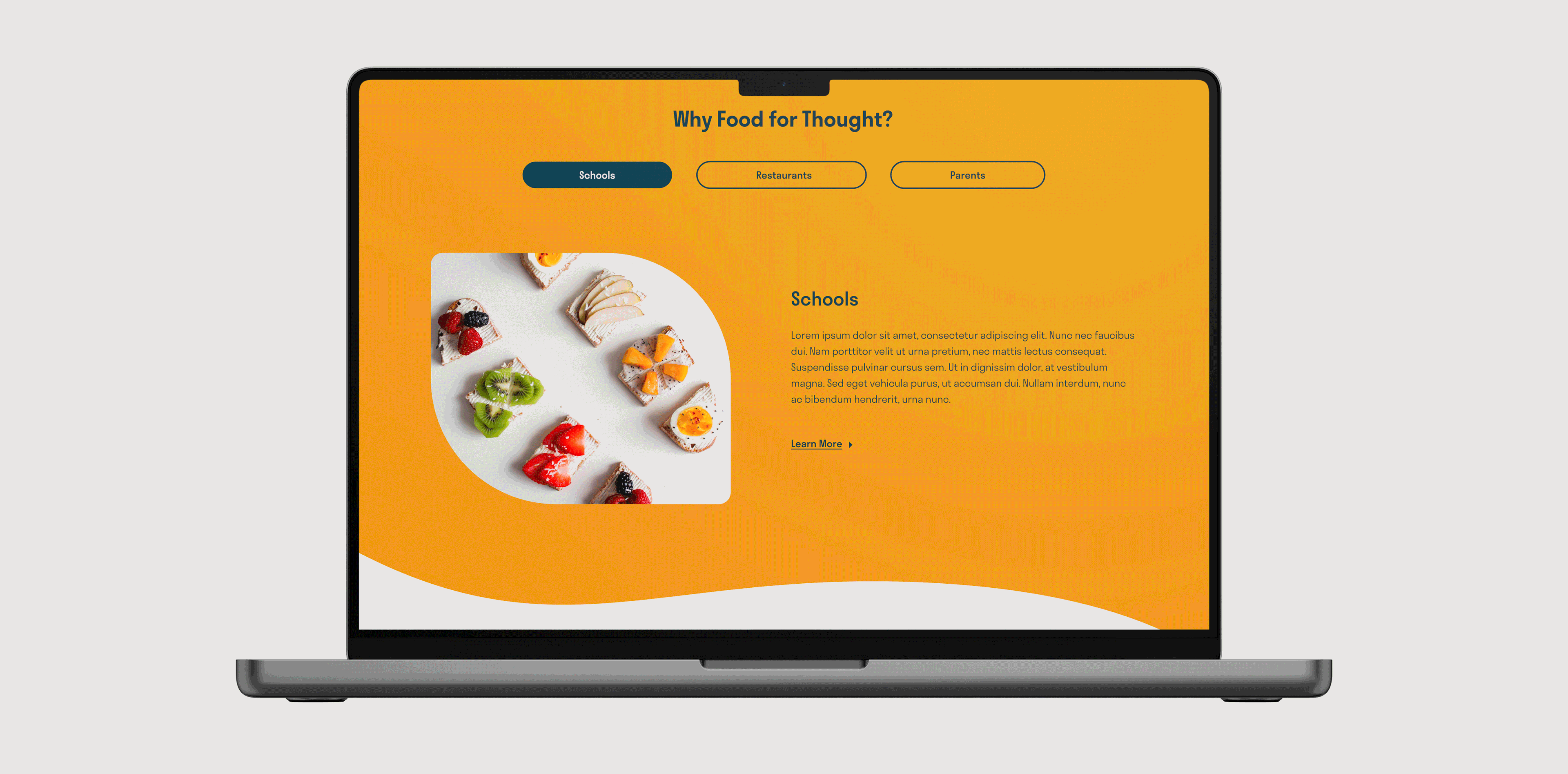
From Wireframe to High-Fidelity Prototype
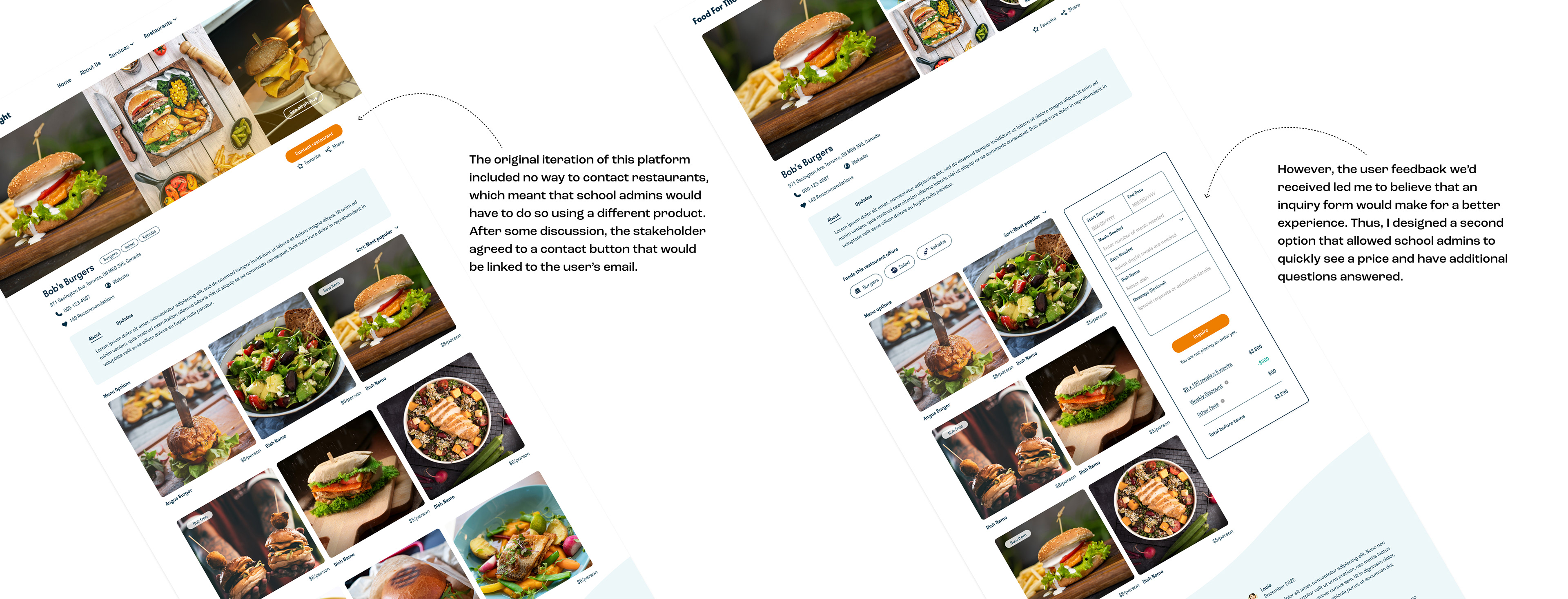
Referencing the elements we settled on during our sketching session, we developed wireframes of key screens that we later presented to the stakeholder (and software engineer) to assess whether the design would present any technical challenges. Once everyone on the team was on board with the design plan, I used our mood board to begin fleshing out the wireframes. With a bit of design experimentation, we ultimately produced a fully-functional prototype—ready to be put to the test.
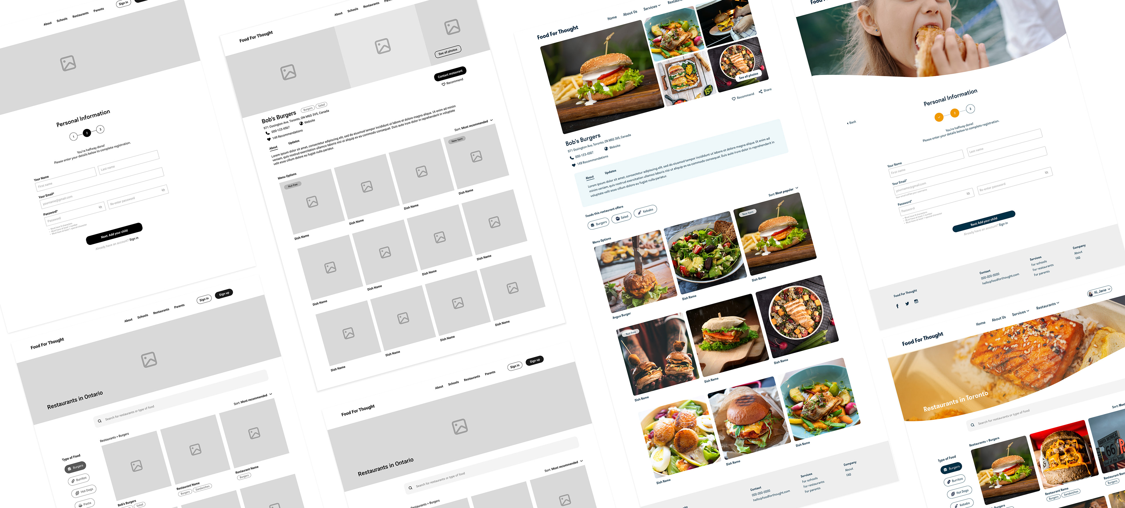
I was after an overall design that conveyed cleanliness, trustworthiness, and joy—I believe I accomplished that. Using a combination of ample white space, bold imagery of joyful kids, a playful sans serif font, and pops of saturated color, the website makes an otherwise dull process more palatable and dare I say, enjoyable. Check out the complete prototype below.
NEXT STEPS
Unfortunately, we did not have the time to conduct usability testing at this time. However, we equipped the stakeholder with a script and prompts to begin gathering usability feedback from other parents. Depending on the results, changes to the design will be made accordingly. Additionally, more interviews with school administrators and food providers must be arranged in order to determine how to evolve the design to meet their unique needs.
REFLECTIONS
If I'm being honest, this project posed a big challenge for me but I can truthfully say that I'm proud of the work that my partner and I did throughout. We were presented with an ambiguous product, built on conjecture rather than true consideration of the user's needs. We had to remain steadfast in our conviction to advocate for the user and be willing to push back on the requests from the stakeholder to remove features that we knew would improve user experience. The original vision was for this platform to be just a resource with no functionality, which meant that users would have to jump between different devices and platforms to meet a need, effectively making Food for Thought impractical—maybe even useless. The research data ultimately confirmed that expanding on the platform's features was the right call and again, made the case for never skipping this step before building a solution.