OVERVIEW
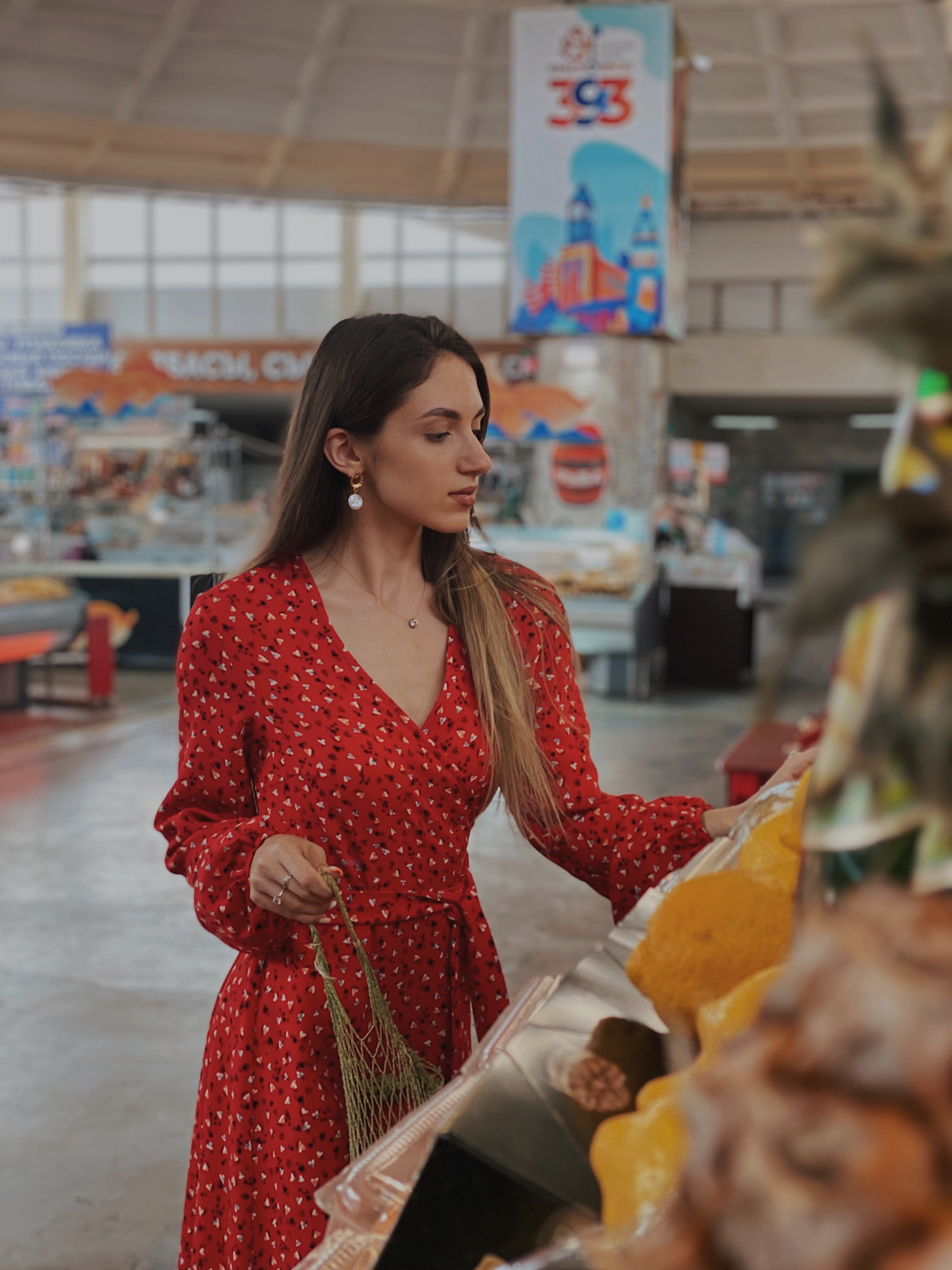
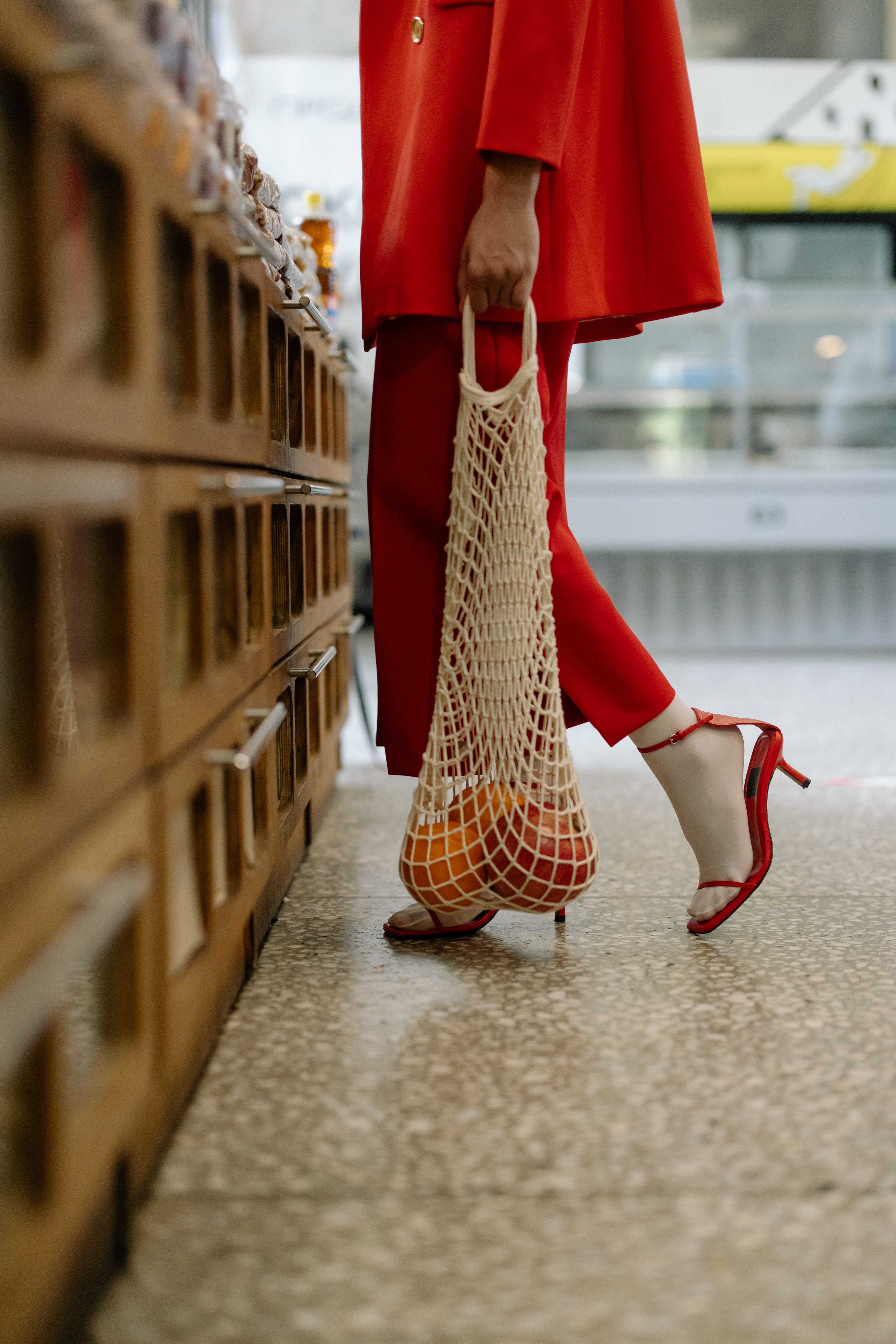
When every grocery store run becomes a scavenger hunt that requires the shopper to decipher ingredients before checking out, sticking to a healthy diet can feel like a herculean task. Eatable aims to break this cycle by helping its users spend less time reading food labels and more time enjoying healthy meals.
ROLE
UX researcher, UX/UI designer
TEAM
Solo project
TOOLS
Otter.ai, Miro, Illustrator, Adobe XD
TIMELINE
4 months
THE CHALLENGE
As the prioritization of personal health and wellness has risen so, too, has the number of healthy food options. And yet, despite having information at our fingertips and more food variety than ever, determining what is healthy has never been harder—often resulting in a bewildering grocery store experience.
THE SOLUTION
In order to minimize confusion at the grocery store, I developed Eatable, a mobile app that makes finding healthy food products easier. But of course, 'healthy' is a subjective term. So instead of focusing on a rigid set of dietary guidelines, Eatable filters food based on the user's preferred diet or ingredients. No more googling obscure ingredients while standing in the grocery store aisle. Just search or scan and go—doesn't get simpler than that.
THE PROCESS
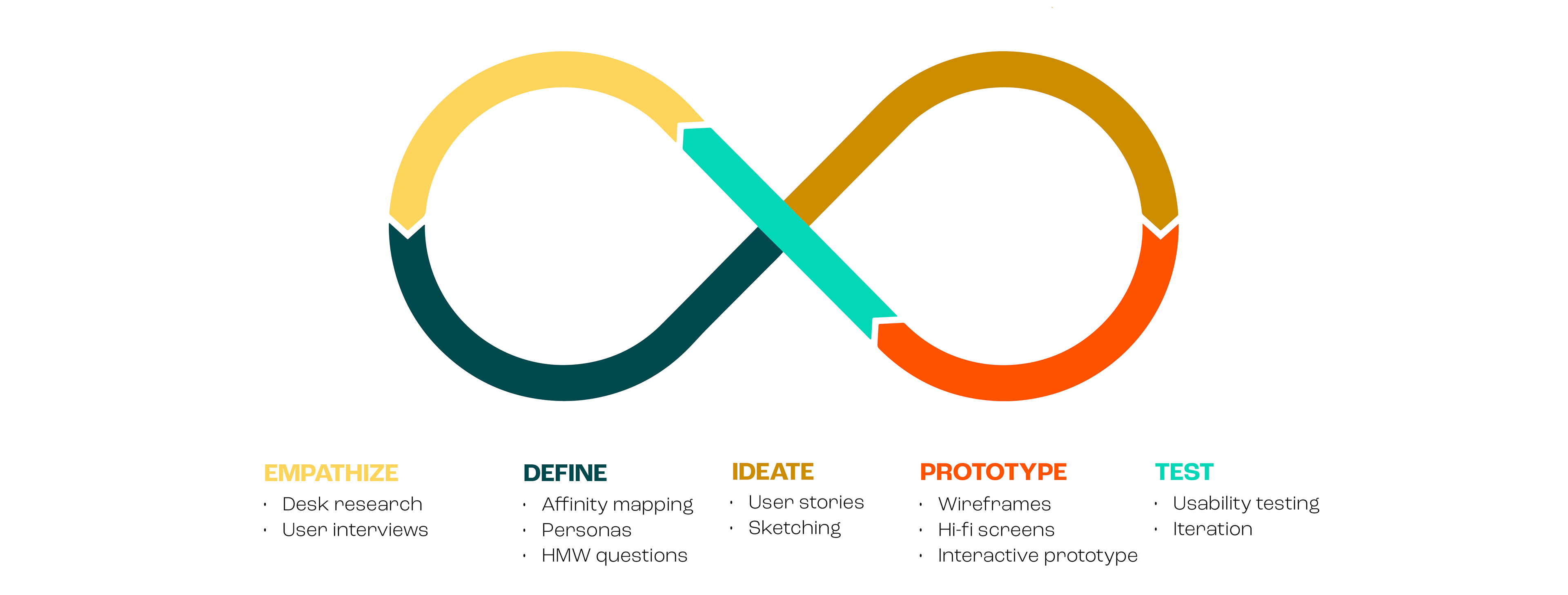
Faced with a nebulous challenge, I decided to adopt a design thinking approach. As such, I employed a variety of iterative UX methods to first identify the core problem, then ideate solutions, and ultimately implement a human-centered solution.
EMPATHIZE
Hitting the Books
The most meaningful solutions to user problems stem from deep understanding and empathy, which can only be achieved by asking questions. So I crafted a research plan to guide me in identifying how and where health-conscious millennials discover healthy foods, and what (if anything) prevents them from meeting their health goals. The first step in my discovery journey— desk research—led me to discover the following:
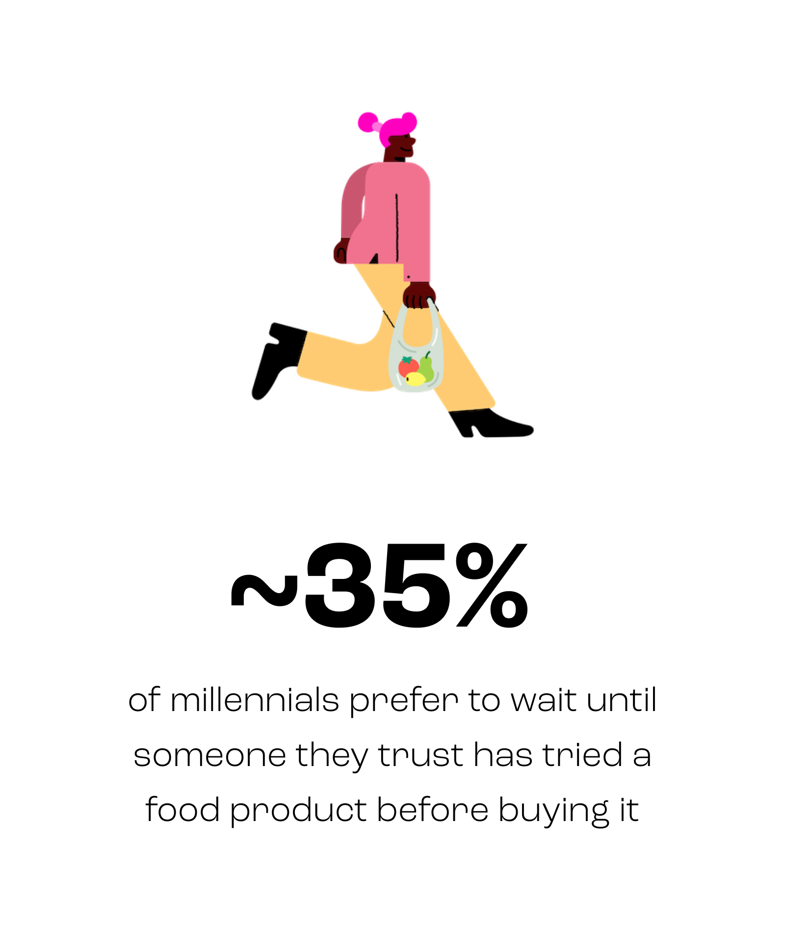
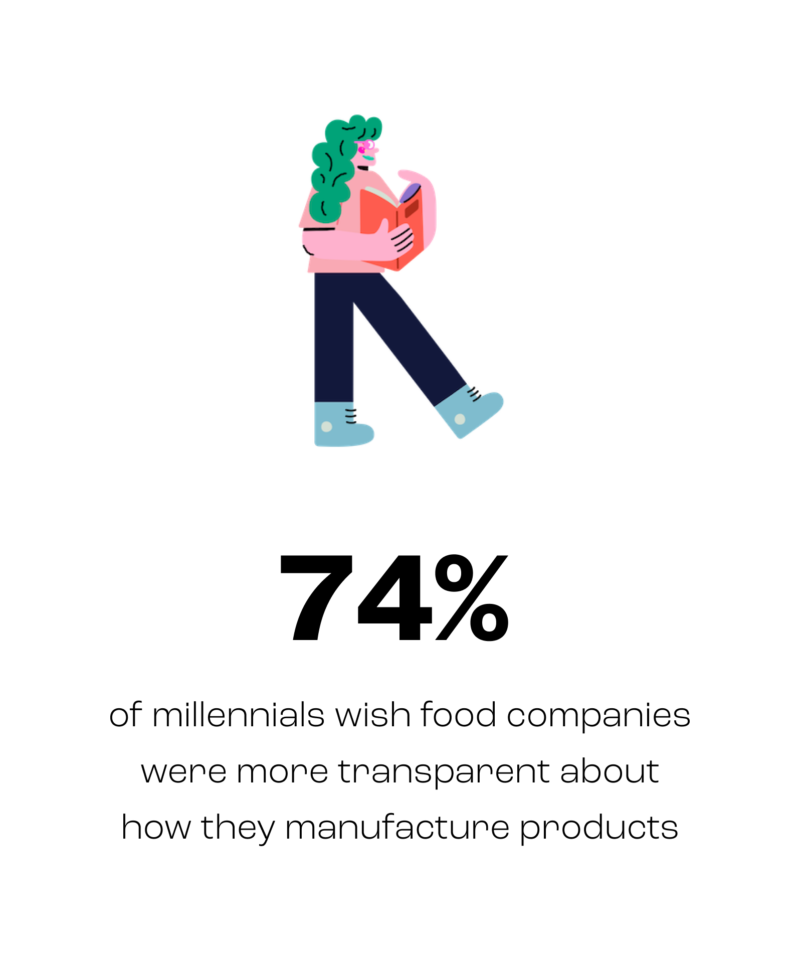
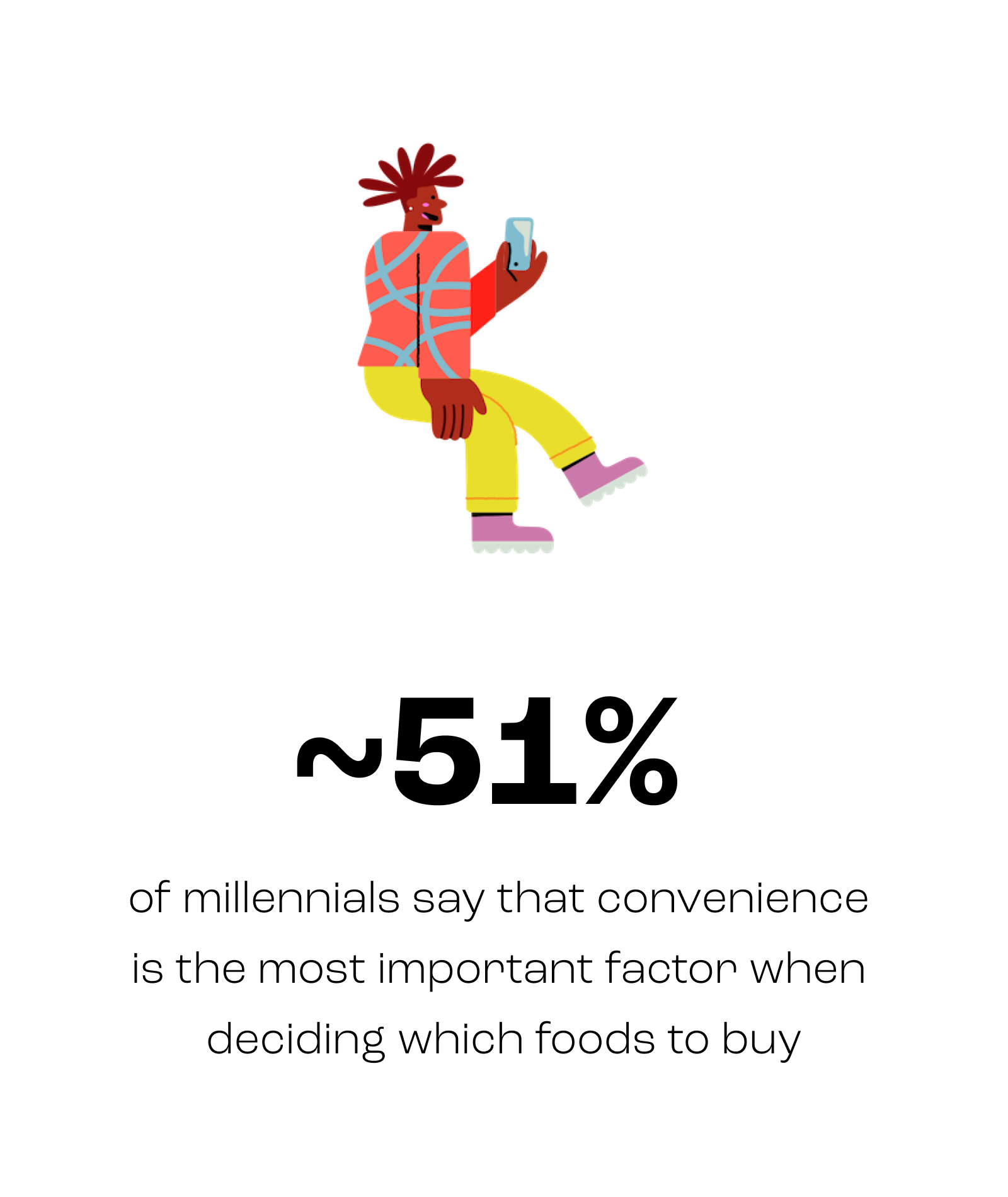
Since the majority of millennials seek convenience and food transparency, I hypothesized that they may enjoy an online food shopping platform that could provide them with both. However, this supposition would first have to be confirmed with user interviews.
Getting the Facts Straight
My desk research findings, along with the objective I established in my research plan, informed my approach to conducting user interviews. Using a screener survey to find millennials with an interest in personal health and wellness, I recruited five participants—one male and four female—and conducted 45-minute, semi-structured interviews with each.

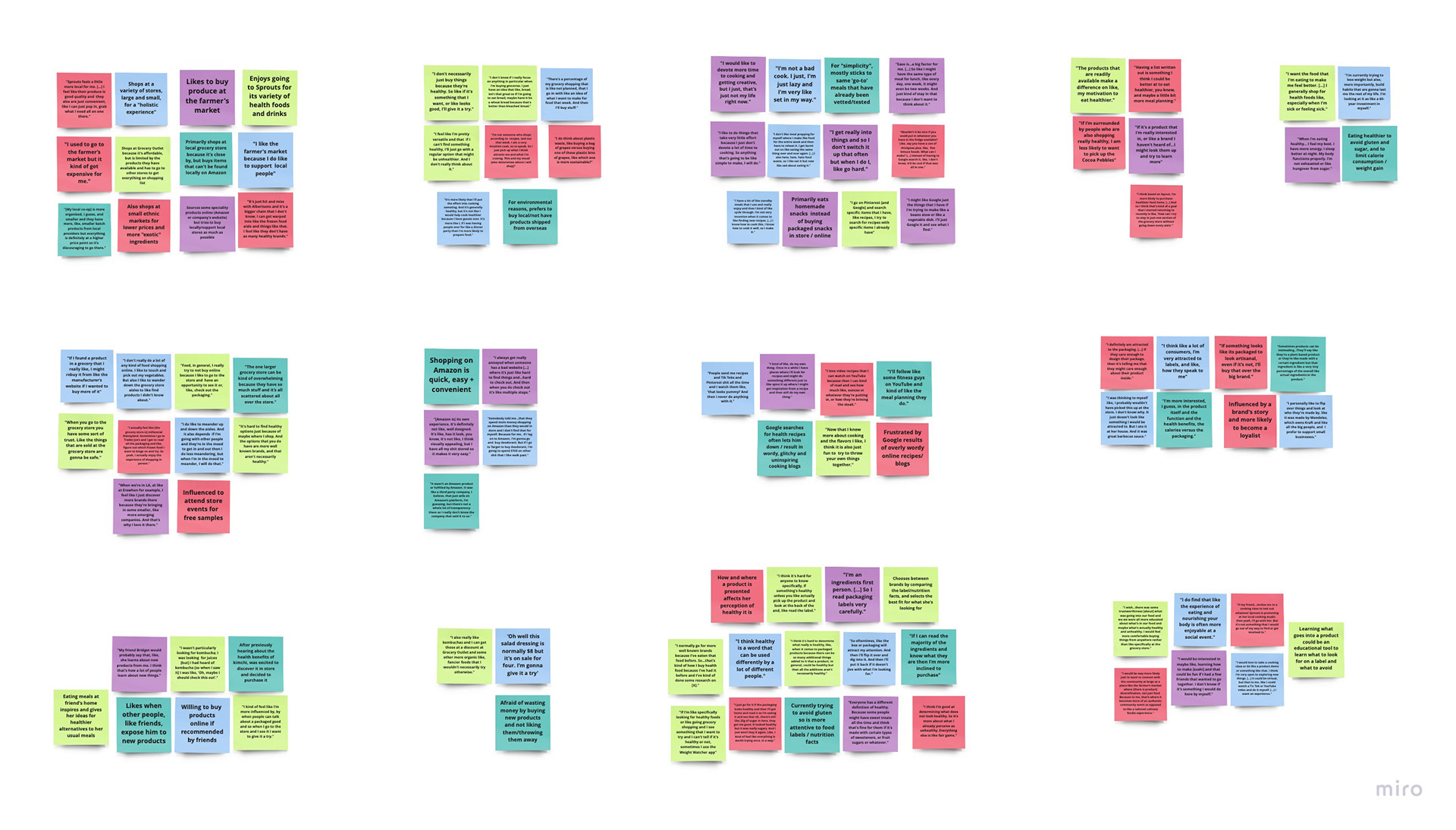
I had hypothesized that millennials would prefer to shop for food online, so I was particularly interested in determining where they currently discover and buy healthy food. I also wanted to learn more about the pain points they experience which prevent them from meeting their health goals. So, in order to synthesize the data I had collected during my interviews, I crafted an affinity diagram that revealed an unexpected pattern.
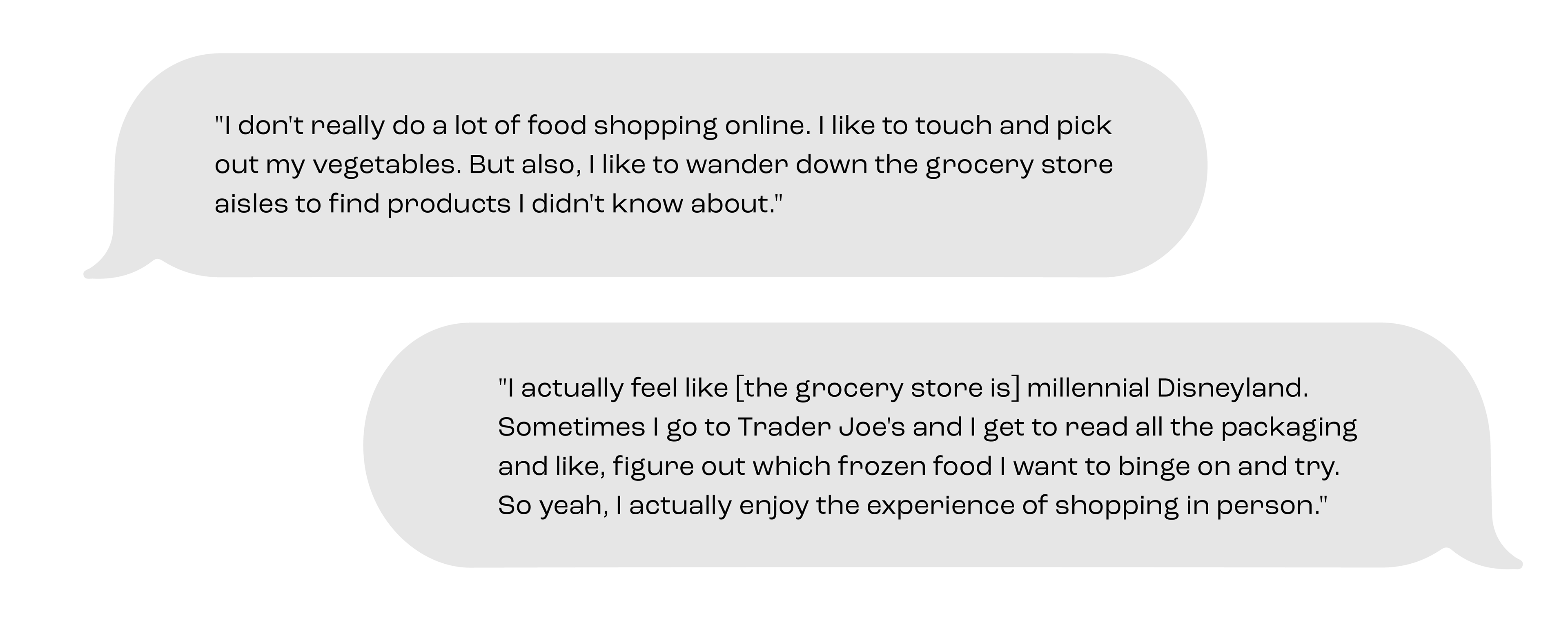
Although my desk research findings were validated by user interviews, I was surprised to discover that, despite craving convenience, millennials prefer to shop in-store as a way to support their community and discover new products. However, there was also an overwhelming frustration with confusing product labels and deceptive packaging that made navigating the grocery store a more complicated endeavor than it needed to be.
DEFINE
Putting a Face to the Name
After diving into the problem space, I determined that the biggest issue surrounding healthy eating is a lack of education and transparency about product ingredients. And so, I set out to explore how I might make it easier to determine which foods are healthy. But first I needed to craft personas that would act as my northern star when exploring potential solutions.
By defining who the solution would be created for, I could maintain the focus and empathy required to determine which features and elements would be necessary (or unnecessary) in the final product.
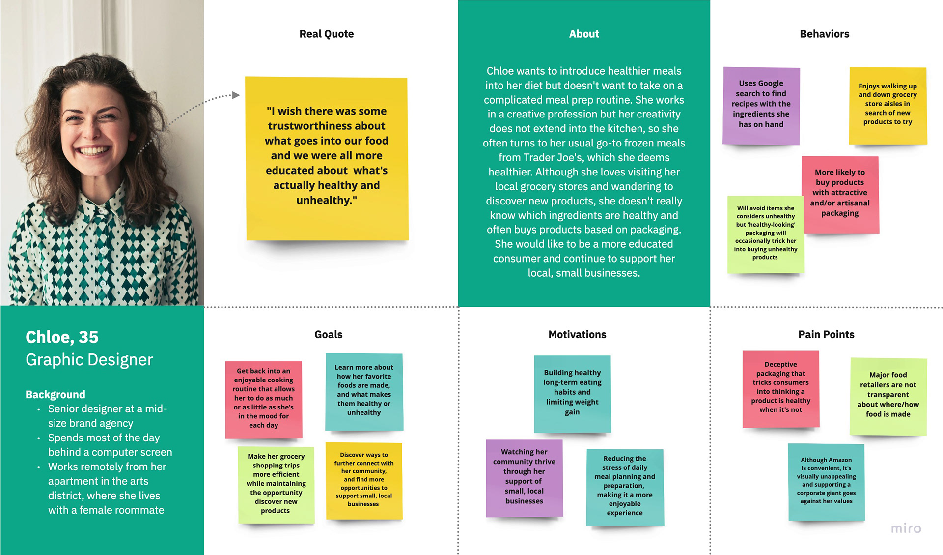
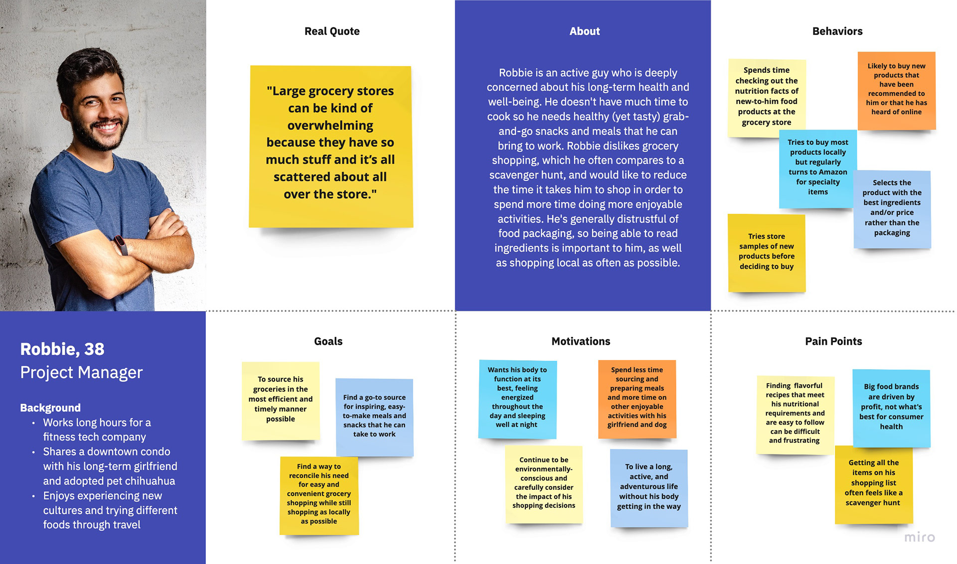
Research ultimately uncovered two personas: Chloe who distrusts large food brands and wishes it was easier to determine which foods are healthy; and Robbie who is driven by convenience and wishes there was a way to make grocery shopping more efficient.
IDEATE
The Birth of an Idea
With the problem defined and my user identified, I brainstormed to identify possible solutions and later narrowed down my ideas to the two strongest contenders. But the solution to a complicated problem is not another complicated tool, so I knew that my final selection would be a swift and simple food-filtering app. And so, Eatable was born.
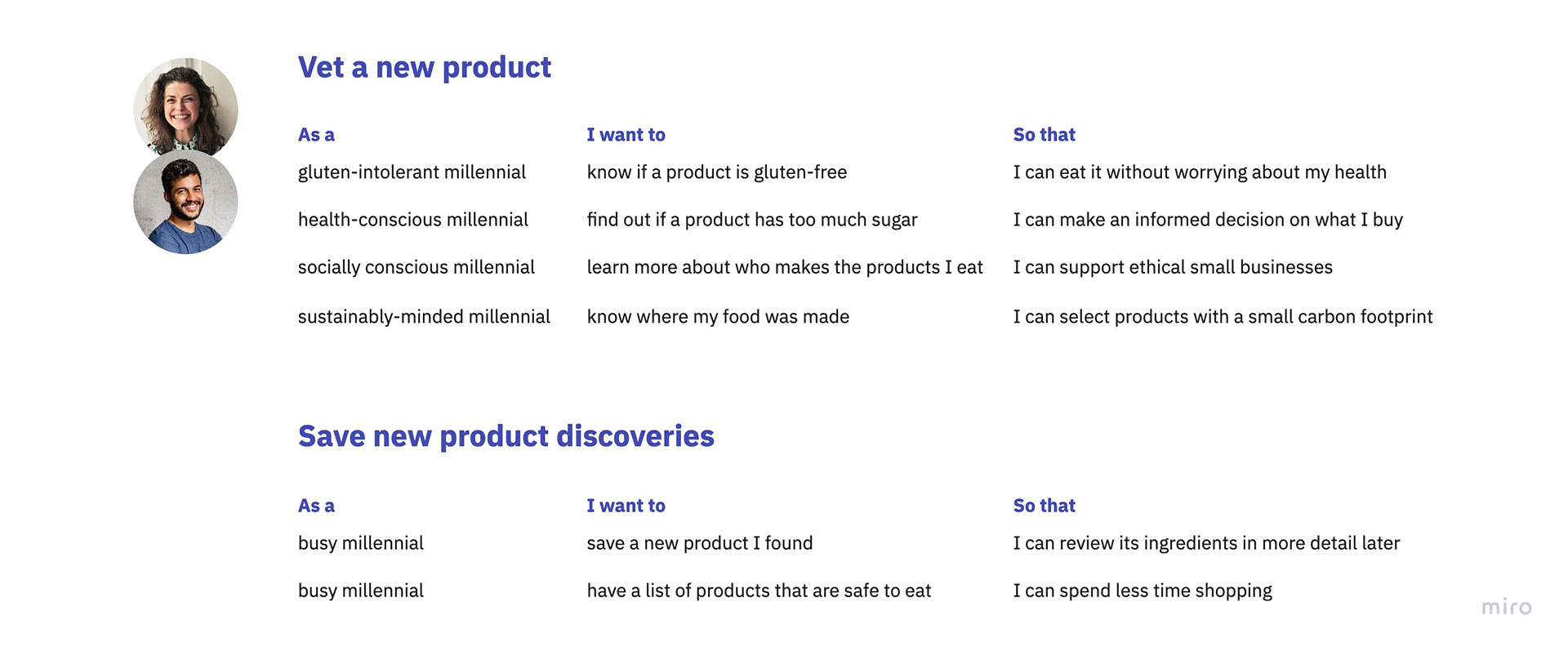
Everything Starts with a Story
Before allowing the idea to fully materialize, I checked back in with Chloe and Robbie, my user personas, to consider how this product could deliver them value. From their perspective, I crafted a series of stories that guided the features (and functions) that would form my minimum viable product, or MVP.
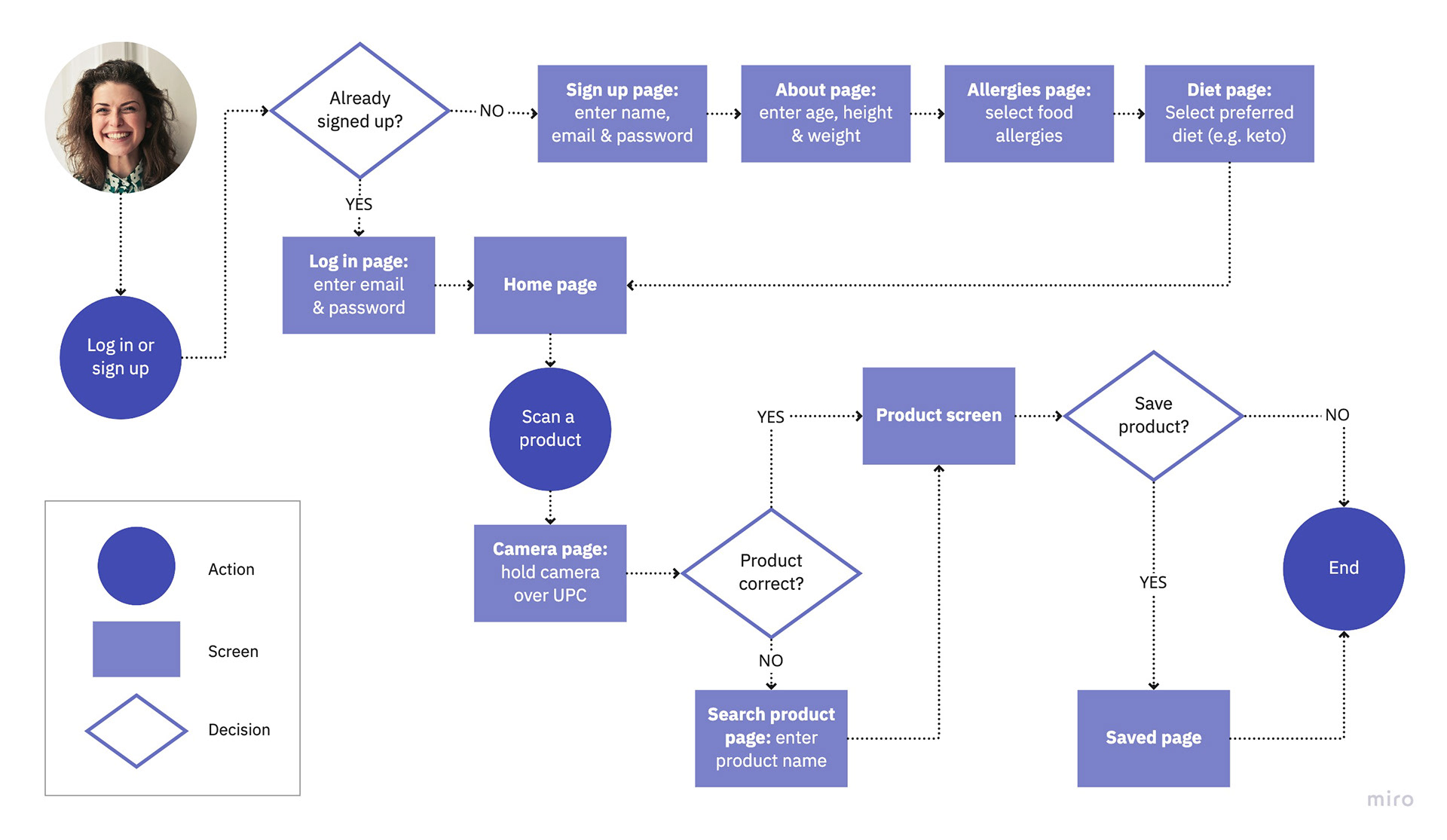
Going With the Flow
User stories helped me understand what Chloe and Robbie would do, and why, but I still needed to determine how. So I developed user flow charts that helped me visualize the paths they would take to complete tasks and most importantly, keep them as simple and intuitive as possible. Their ultimate efficacy would, of course, have to be validated later in the process.
Sketch It Out
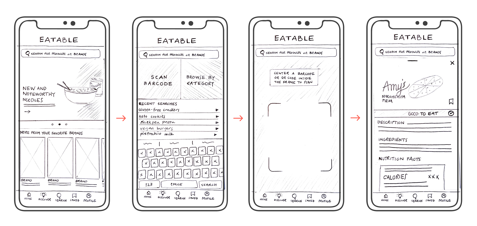
With an understanding of the app’s basic functions and features, it was time to put pen to paper—one of my favorite analog activities. I turned to Crazy 8’s as a means to quickly move through variations on the design, without overanalyzing any of them, and allow me to explore even more options. I ultimately landed on an ultra-minimal design that relies on bold imagery to guide the user without detracting from the most important elements.
PROTOTYPE
Good Bone Structure
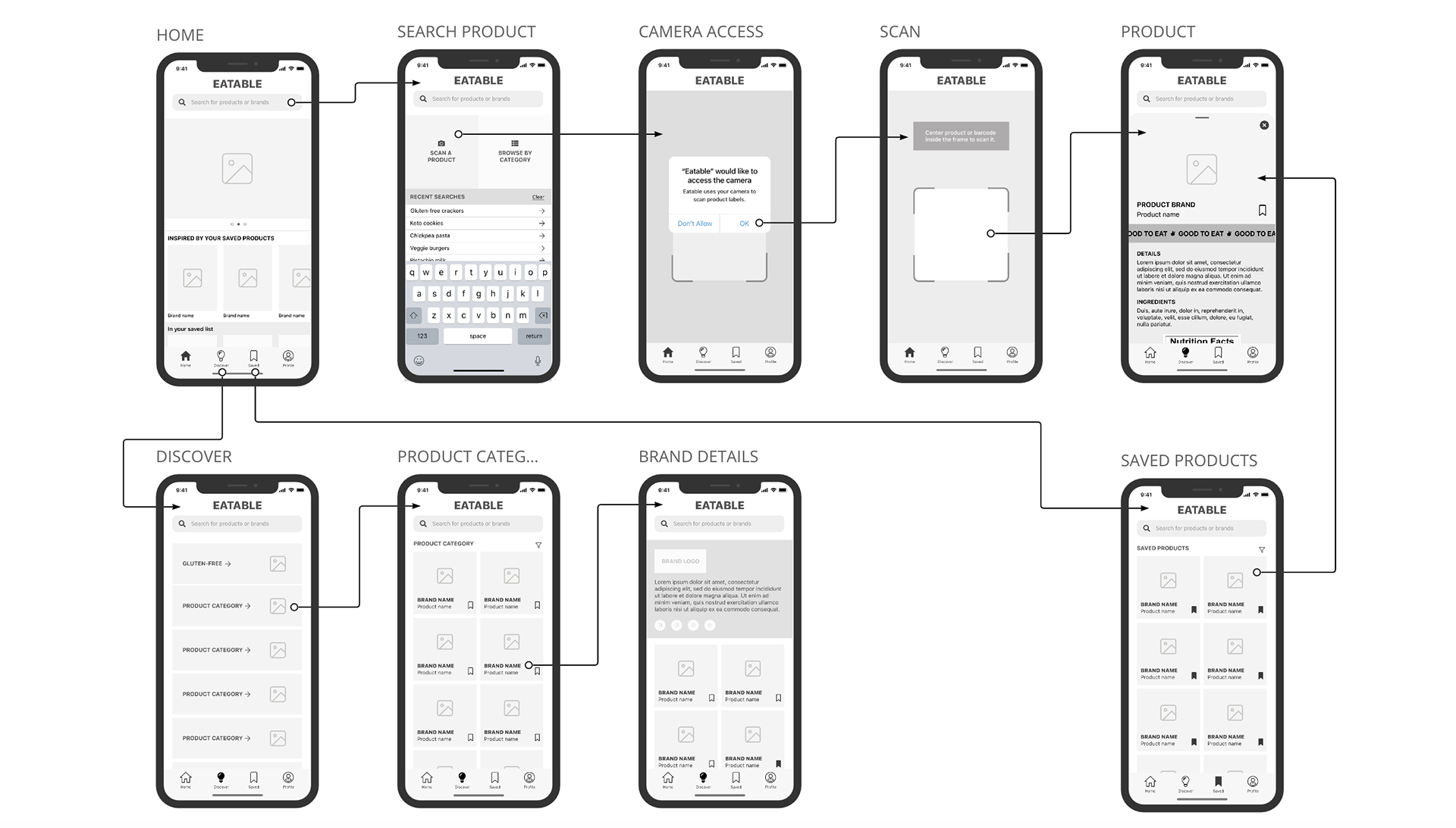
Once I had a design direction for the app’s layout, I needed to make my solution tangible and most importantly, testable. But before I could properly prototype the product, I needed to refine its structural elements. So I assembled wireframes of my MVP screens in order to review how all elements would relate to each other and establish a proper content hierarchy before moving on to the app’s UI design.
A Much-Needed Facelift
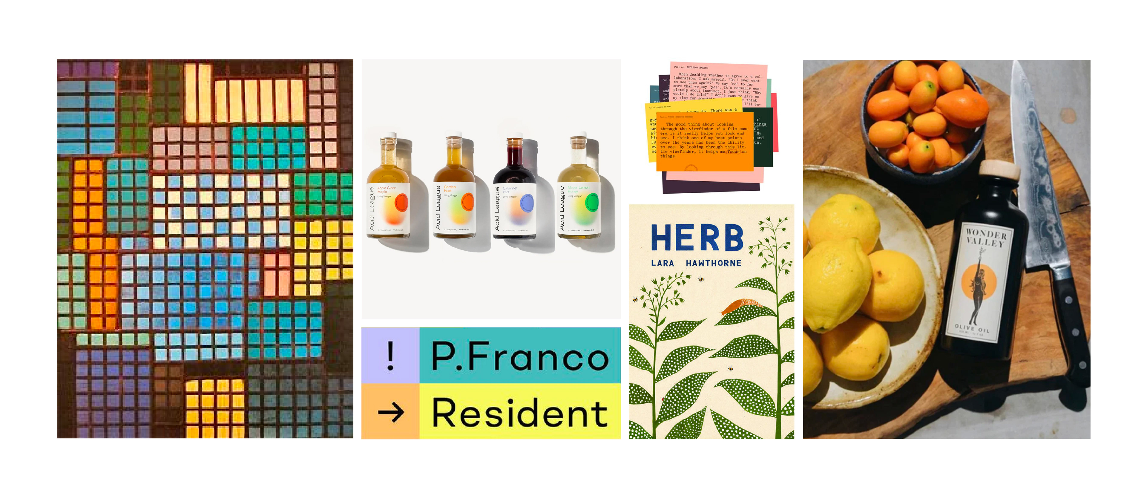
Although anyone could use this product, my earlier research led me to determine that its primary target market would be millennials who deeply care about their personal health and wellness. With this in mind, I pursued a clean, minimalist design that conveys joie de vivre through bold imagery and vibrant color. Eatable’s goal is to minimize frustration and maximize delight when shopping for food so this guided my mood board image selection and ultimately, the design direction.
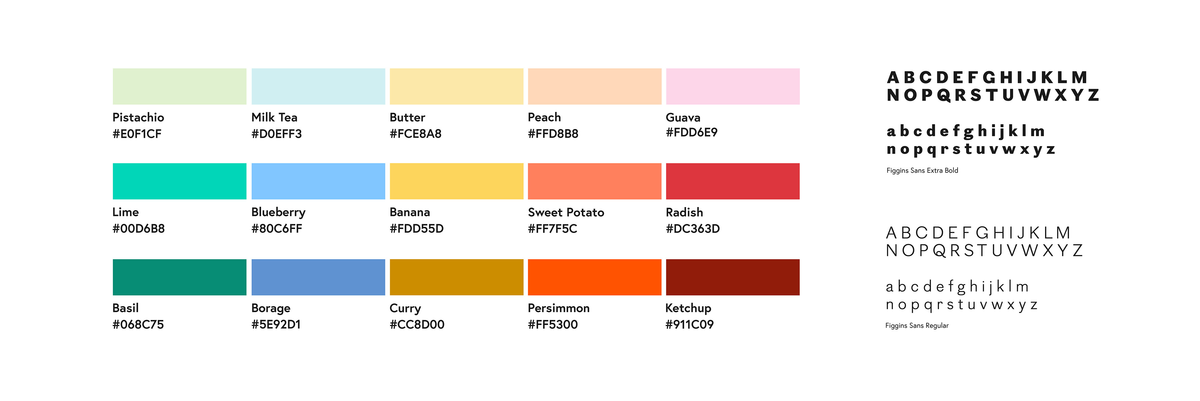
I then developed a style guide to ensure the entire experience maintained a consistent look and feel. Eatable’s color palette aims to give the product vibrancy and variety—all while establishing the brand’s playful and peppy personality. But to balance a bold color story and avoid overwhelming the user, a single type family is used throughout. Overall, I pursued a minimal but not modest design.
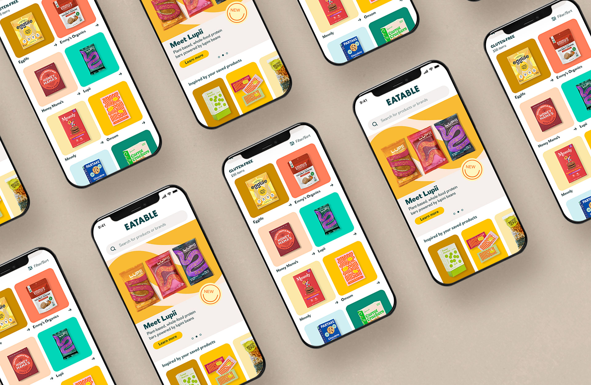
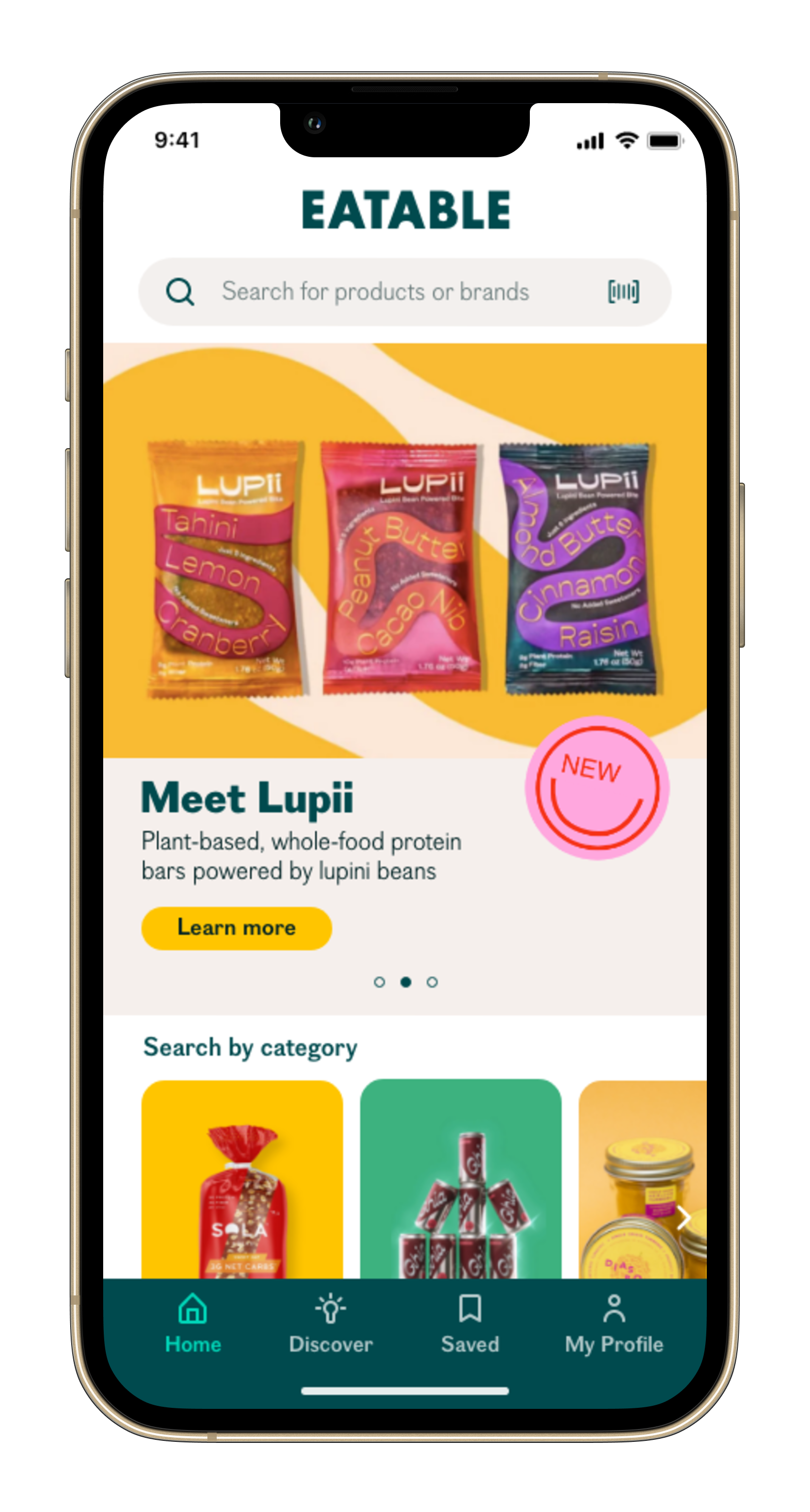
The Grand Reveal
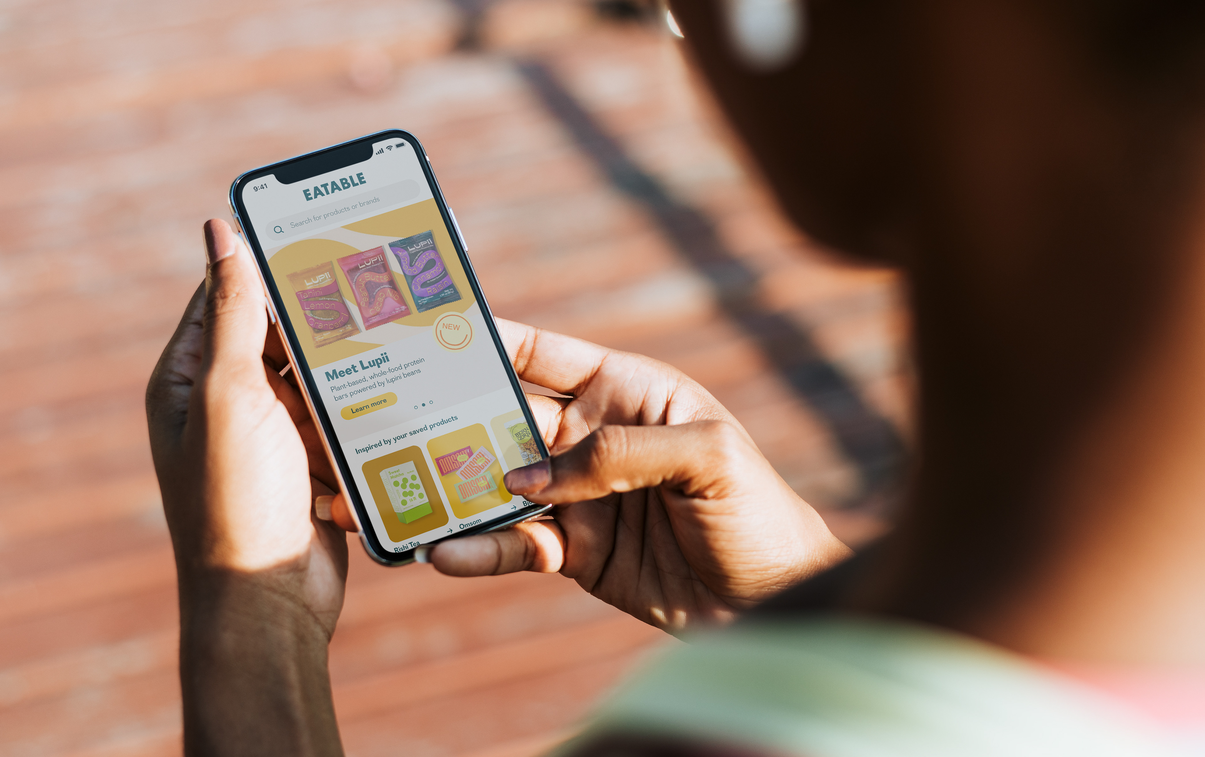
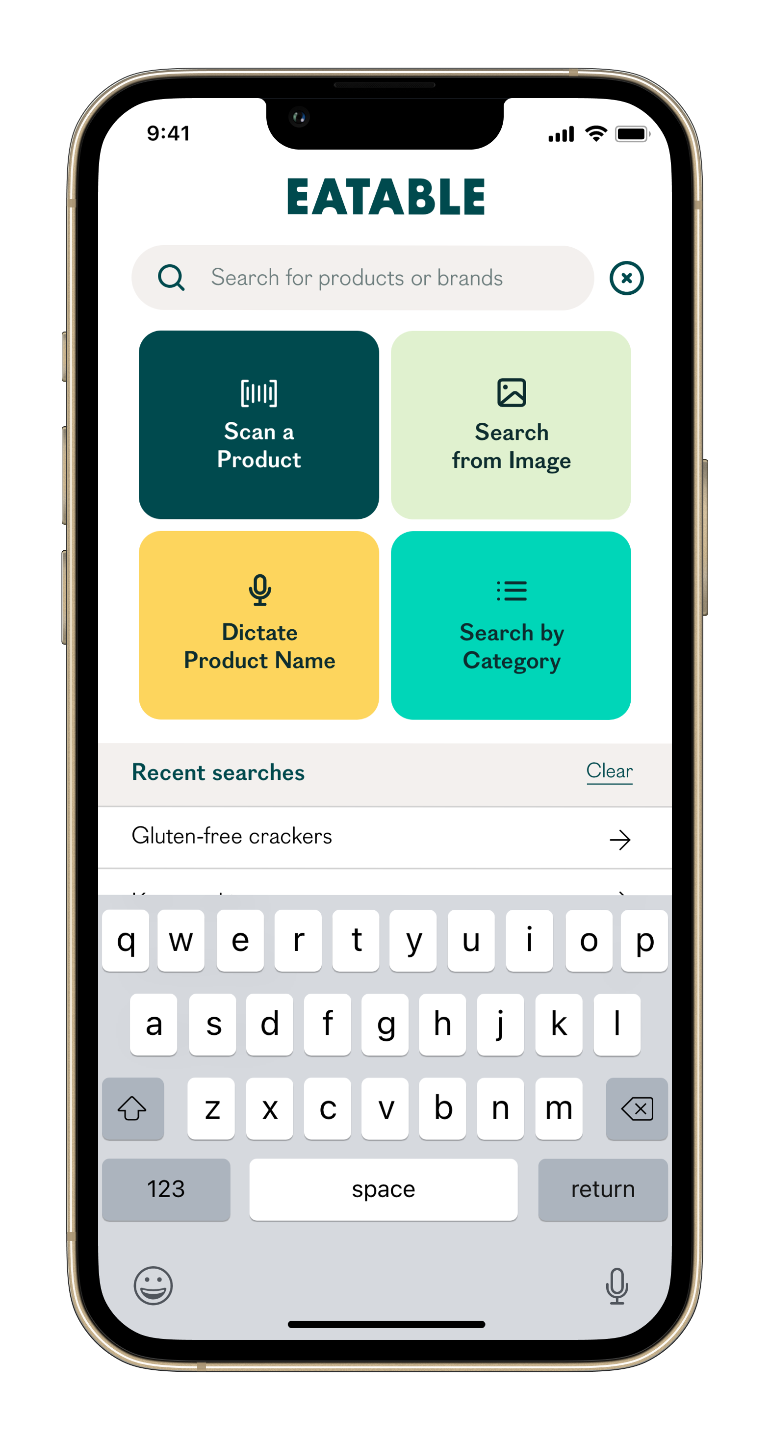
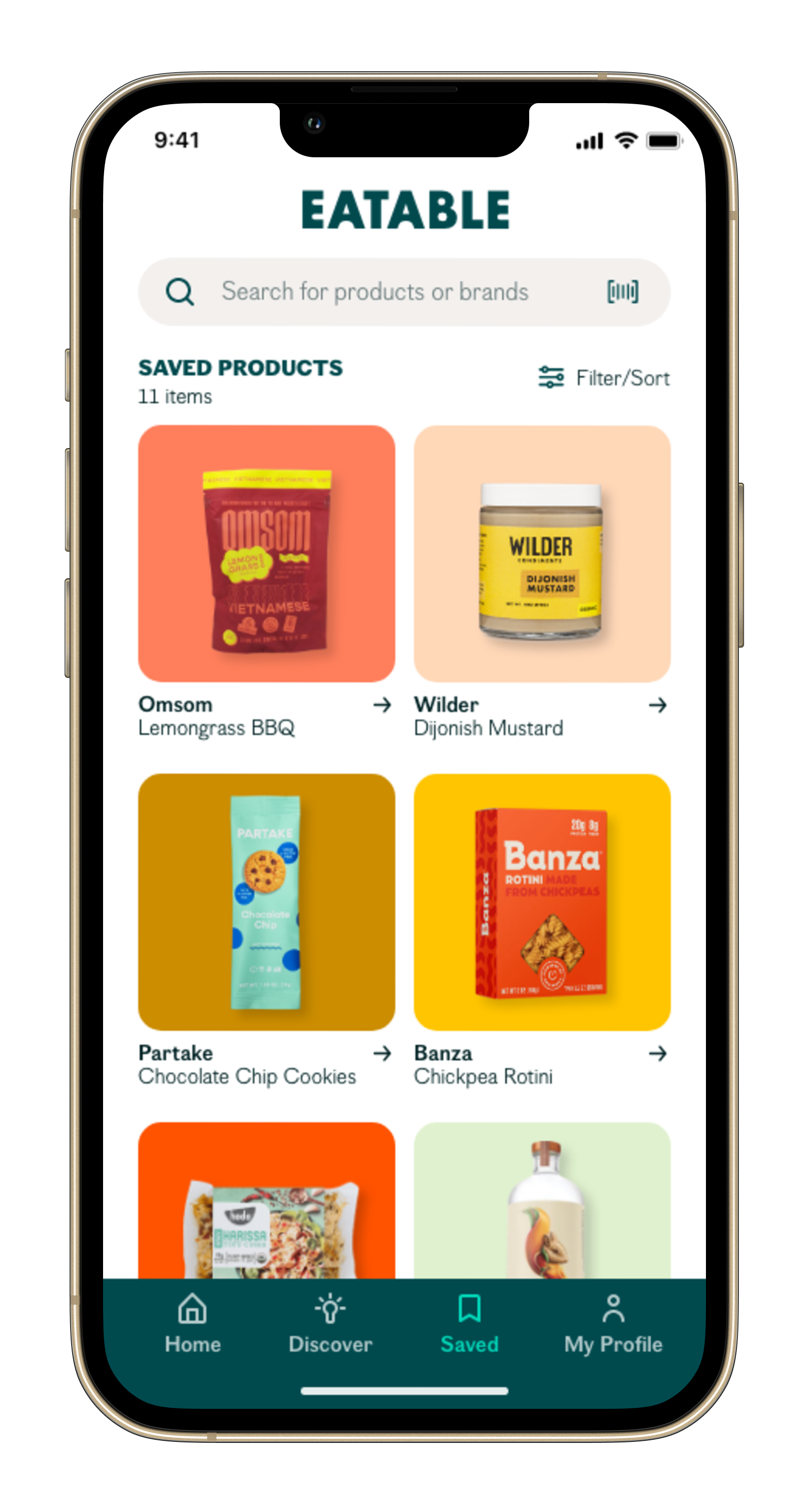
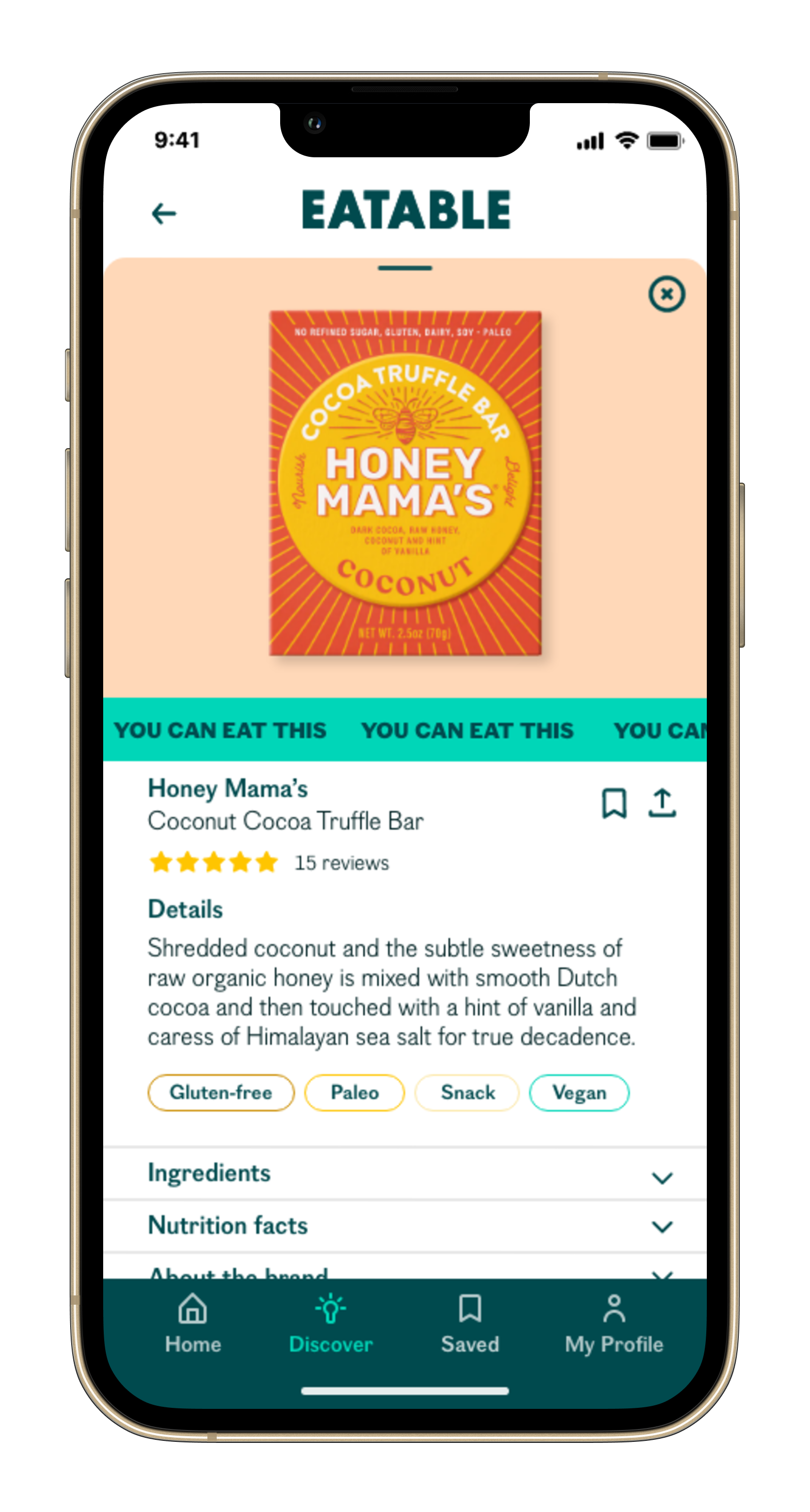
And from wireframes and a style guide, the high-fidelity interactive prototype materialized. Predominantly using scale and color, the final design keeps the eye engaged and moving. The search bar, prominent and ubiquitous, keeps the app’s primary features—search, scan, say, and save—easy to spot and select. Likewise, the ever-present bottom navigation supports the search bar with an uncluttered design.
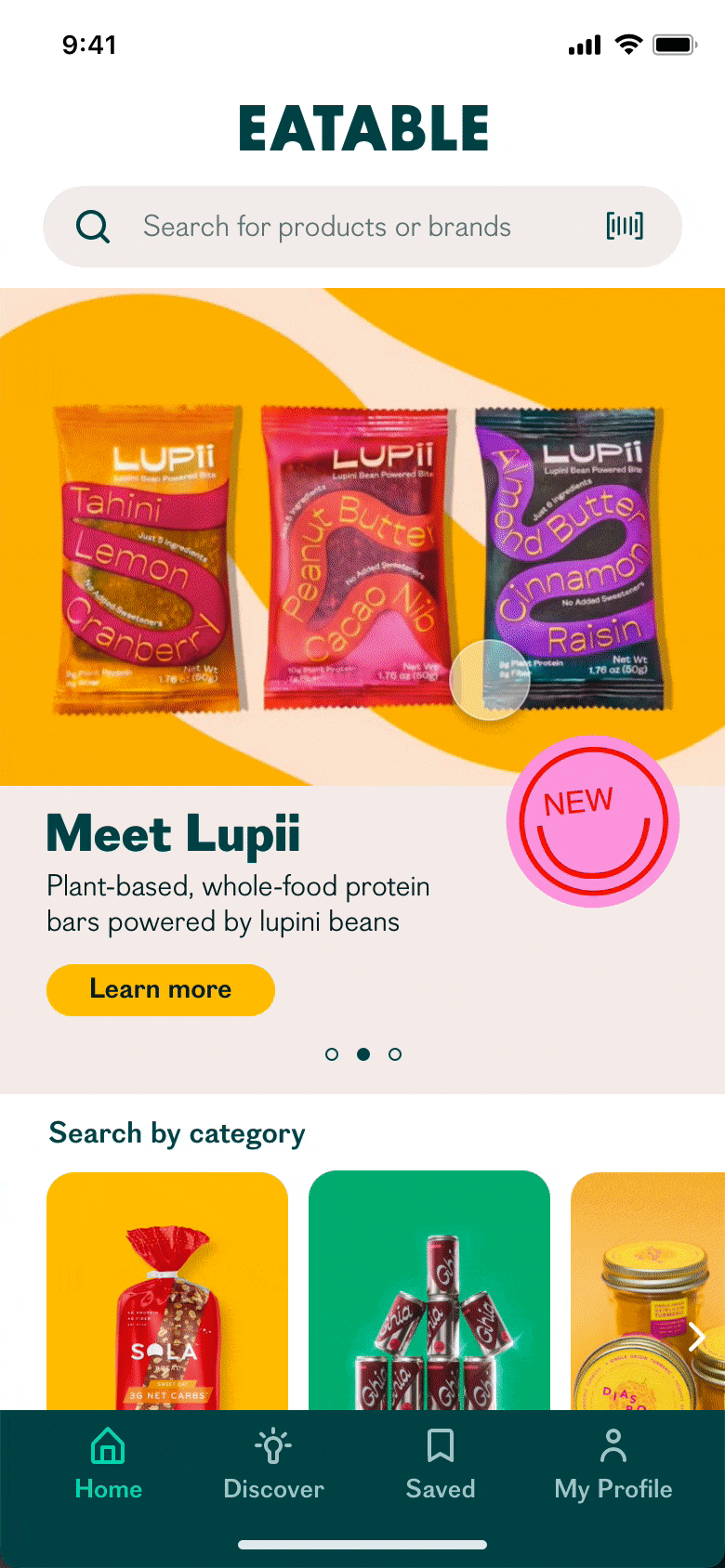
Admittedly, it was no small feat combining inconsistent food packaging imagery with Eatable’s technicolor palette but by keeping the background, type, and iconography simple and neutral, I believe I was able to craft a well-balanced design that excites without overwhelming. Now, the design had to be put to the test.
TEST
The Moment of Truth
By putting the prototype to the test, I sought to determine how efficiently users were able to complete tasks, what their perception of the design was, and whether they encountered unforeseen usability issues. With this in mind, I developed a discussion guide, which included four tasks users would attempt to complete during testing, and recruited participants who fit my user demographic. I ultimately completed five moderated, remote usability tests spread out over a week and in the end, I was thrilled to receive overwhelmingly positive feedback. Users reported loving the concept and enjoying the overall experience. But, of course, nothing is perfect.
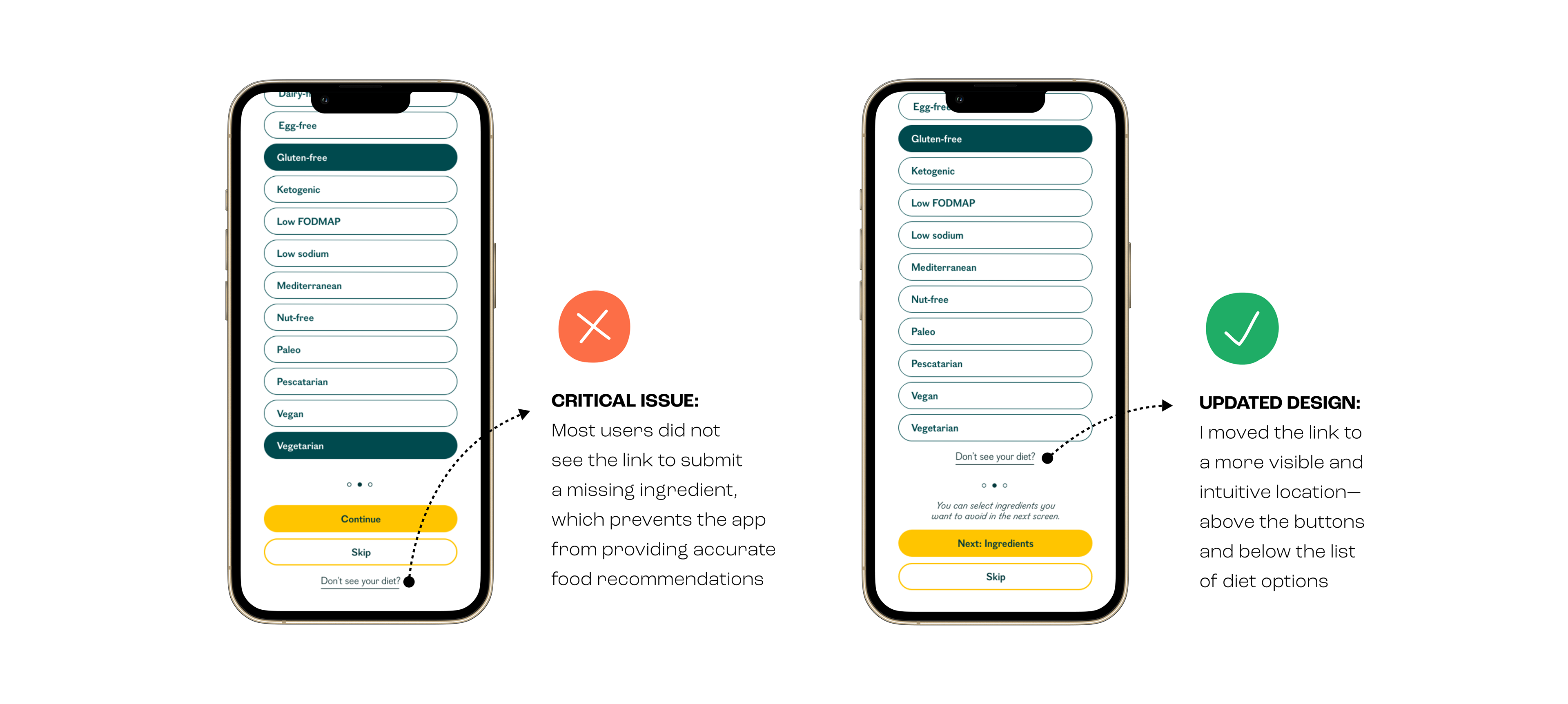
The core function of this product is to filter food products based on their composition but in order for this feature to work properly, the user must first select a preferred diet and/or ingredients they'd like to avoid. I attempted to offer a comprehensive list of choices but undoubtedly, not every option was covered so in order to address these edge cases, I gave users the ability to report a missing diet or ingredient. However, testing revealed that most users were unable to locate the button to do so and skipped the step altogether thus, severely jeopardizing the effectiveness of the app. I knew I had to move the link to a more prominent location.
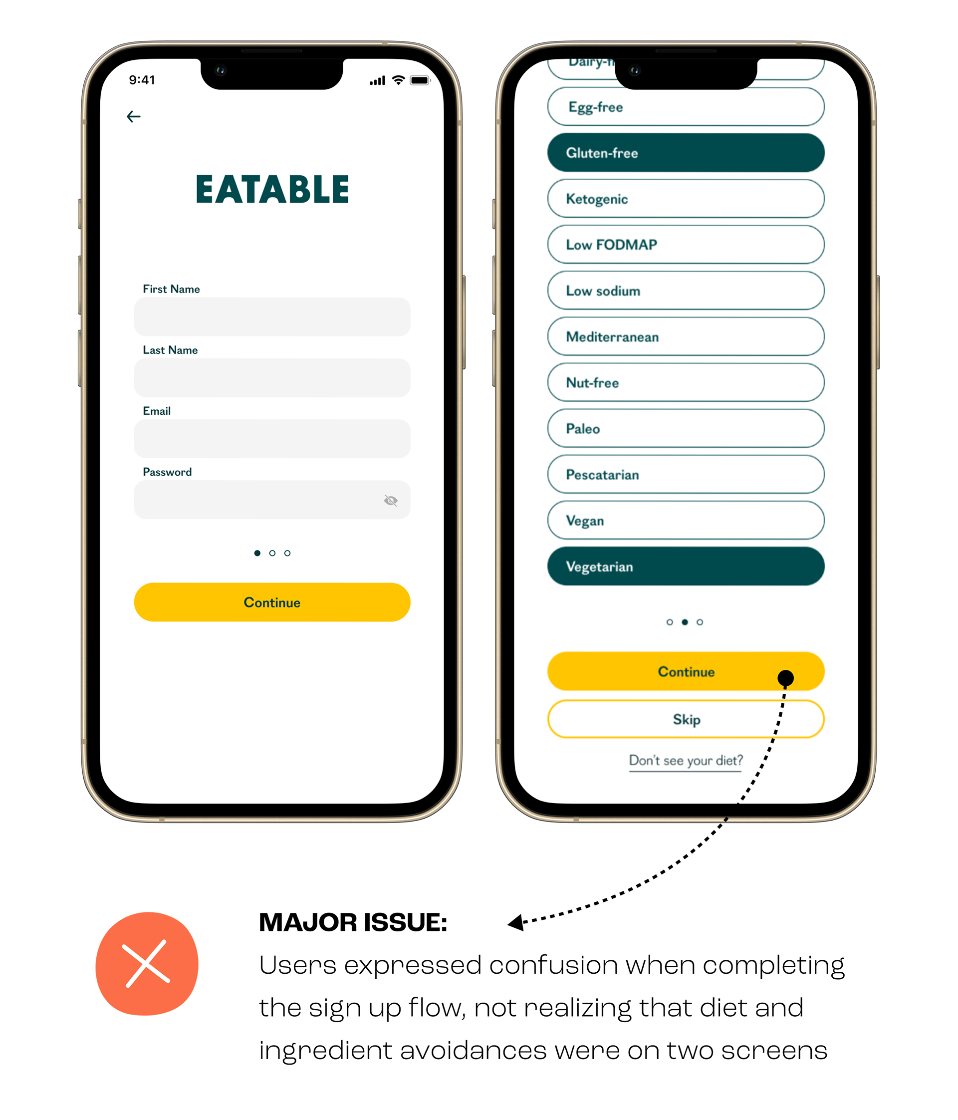
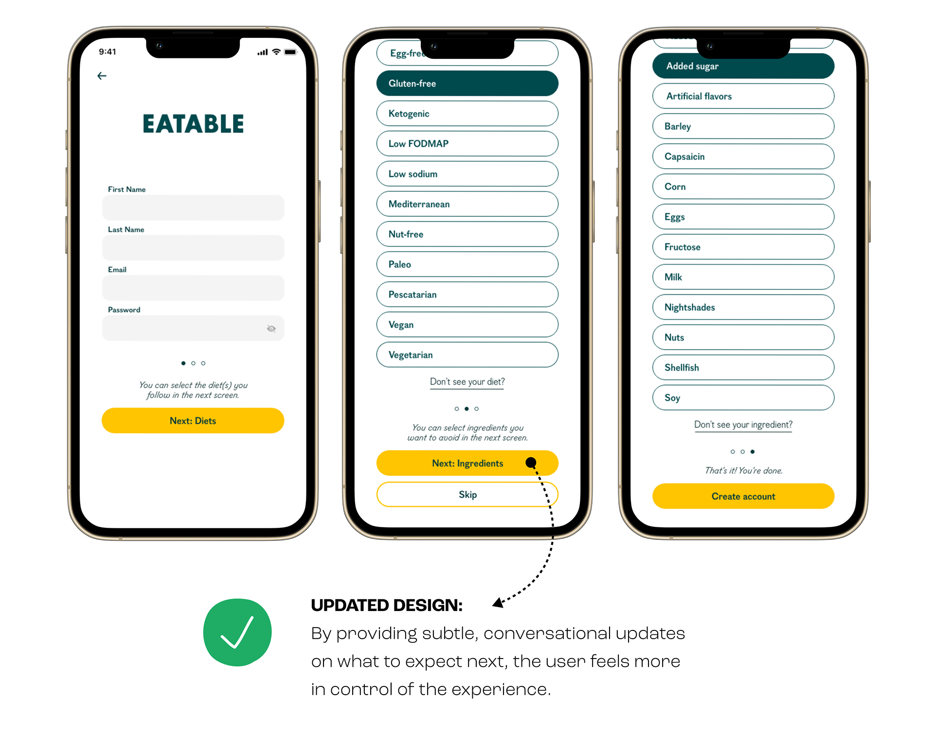
Another—less critical but still important—issue that arose during usability testing was again, related to the account creation flow. During testing, participants were prompted to create an account and select a specific diet (gluten-free) as well as two ingredients they wanted to avoid (wheat and added sugar). Notably, all participants expected to see diets and ingredients listed on one screen, and although this did not ultimately affect task completion, there was noticeable confusion. So, by adding a bit more contextual copy in strategic locations, I hoped to provide users with more clarity and control of the experience.
THE RESULTS
Informed by usability testing results, I made key changes to the prototype design and set out to put the product in users’ hands once again. I recruited another round of participants and conducted five more moderated remote tests. This time I was pleased to discover how well my updates performed amongst participants—there was a 40% rise in the overall task completion rate. In fact, all participants completed the four tasks successfully! Moreover, participants seemed genuinely delighted by the updated prototype, and several mentioned how useful this tool would be to them. What more could a UX designer ask for?
REFLECTIONS
Working on this project was a fruitful and fulfilling journey that strengthened my conviction for a user-centered, data-driven approach to design. I initially imagined an e-commerce platform that could mitigate the problem presented, but after interviewing potential users I found there was little appetite for this solution. So it's not lost on me that this project stands as a testament to the importance of testing and speaking with real users rather than going off assumptions.